09

Rebuilding an association site on eight weeks of evidence

Research · IA · Evidence systemsSandstorm Design · IASLC · 2026
UX ResearchExperience StrategyProduct & Design LeadershipAI & Insight Systems
The problem

A global medical association with content spread across six domains and nine conference sub-brands. The site was not broken. It was built for one audience, and everyone else was left to work it out. Thirteen distinct audiences surfaced in discovery. Six of them had no dedicated journey.

My role

Project-lead UX researcher across discovery, analytics synthesis, survey design, interviews, and information architecture, on a timeline compressed from six months to two.

Approach
  • Coded all 51 proposed navigation destinations by the audience each one actually serves
  • Synthesized 12 months of behavioral data as a screening layer
  • Ran a global survey, then weighted interview recruiting toward the voices it missed
Data sources
  • GA4 and internal site search
  • Lyssna survey, 107 responses across 31 countries
  • Moderated interviews
Audiences
13
Distinct audiences identified in discovery
Unserved
6
Had no dedicated journey anywhere on the site
Destinations
51
In the proposed navigation, each one coded by audience
Jargon
30+
Unexplained insider terms in live content
Strip out the four net-new pages we were proposing and the live site had six destinations built for patients, caregivers, and donors combined.
/ The constraint that shaped the method
09 / IASLC website redesign

I was going to leave before
the research finished.

Interviews would not close before my contract ended, and the architecture was heading into wireframes with an agency and client team who had never sat in a session.

So every artifact had to answer a question I would not be there to answer: how confident are we in this, and what would change our mind?

The evidence system is not a framework I brought in. It is how I solved a delivery risk.
/ Approach
09 / IASLC website redesign

Three evidence streams,
each held to one job

None of them got to do another one's. This went on the first slide of the analytics readout, before a single finding.

Behavioral data

12 months, GA4 and site search
Answers

What people do, where they get stuck, and what they search for that is not there.

Cannot answer

Why they did it. Motivation and context do not show up in a dashboard.

Global survey

107 responses, 31 countries
Answers

What people say they need, ranked and weighted across roles.

Cannot answer

What people actually do. It also misses the least engaged, who do not answer surveys.

Moderated interviews

Recruited against documented gaps
Answers

Why. The context, the workarounds, and what the failure actually looks like.

Cannot answer

Prevalence. An interview finding is never a percentage.

Naming analytics a screening tool up front meant nobody could point at a traffic number later as a reason to skip the research.
/ The evidence system
09 / IASLC website redesign

Three layers, so confidence travels with the decision

We shipped the architecture as a working hypothesis rather than a recommendation, and made the confidence behind every line of it visible on the page.

Layer 01

Verdict before recommendation

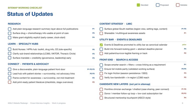
Sitemap working checklist with a status verdict on every proposed change
Every item carries a status and the participants behind it, so nothing enters the structure unattributed.

Keep protects what already works from being redesigned anyway. Verify names the open question and what would answer it, so silence never reads as a yes. Change is reserved for where behavior alone is enough to act.

Layer 02

IF / THEN flags

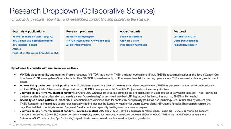
Research dropdown architecture with inline hypothesis flags on each label choice
Flags sit inline in the architecture itself, not in a separate research doc nobody opens.

Every unvalidated assumption shipped with its own test. A members-only tool with a brand name that tells you nothing: if people recognize it, the label works alone. If not, it needs a plain description or nobody finds it.

Layer 03

Triangulation status

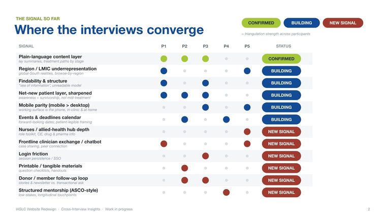
Signal matrix scoring each finding across five participants as Confirmed, Building, or New signal
Twelve signals scored across five participants. Strength is visible per finding, not asserted in prose.

Confirmed means independent voices agree, including at least one who does not personally need it. Building is more than one voice but not yet enough to earn structure. New signal is tracked, waiting on more voices.

The plain-language content layer reached Confirmed partly because a participant with a science background, who did not need it herself, named it as a gap for everyone else. Stronger evidence than three people asking for something they want, and the tiering put that difference on the page.
/ The artifacts
09 / IASLC website redesign

Where the two methods met,
and where they disagreed

Twelve months of behavioral data and a global survey, held against each other rather than reported side by side. Verbatims are attributed by role and region only.
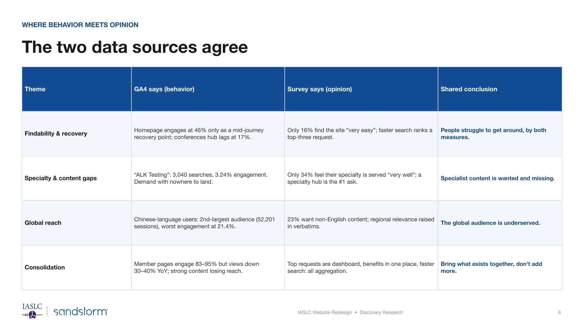
The convergence table. Every theme carries what the analytics showed, what the survey said, and only then the
The convergence table. Every theme carries what the analytics showed, what the survey said, and only then the shared conclusion. Where the two disagreed, neither was promoted to a finding.
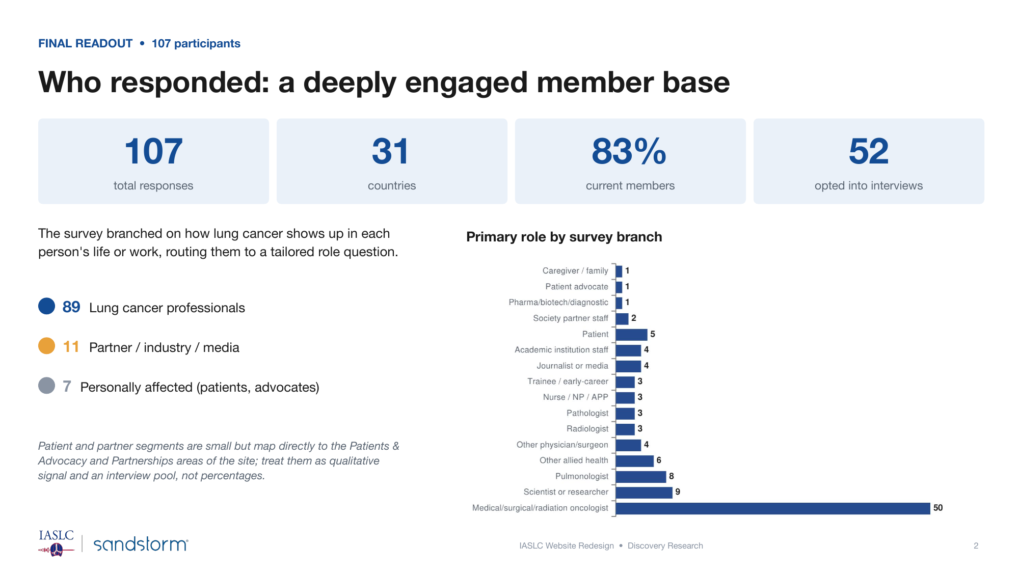
Who answered, and the honest limit of it. The survey branched by how lung cancer enters each person's life; th
Who answered, and the honest limit of it. The survey branched by how lung cancer enters each person's life; the patient and partner segments are named as an interview pool rather than reported as percentages.
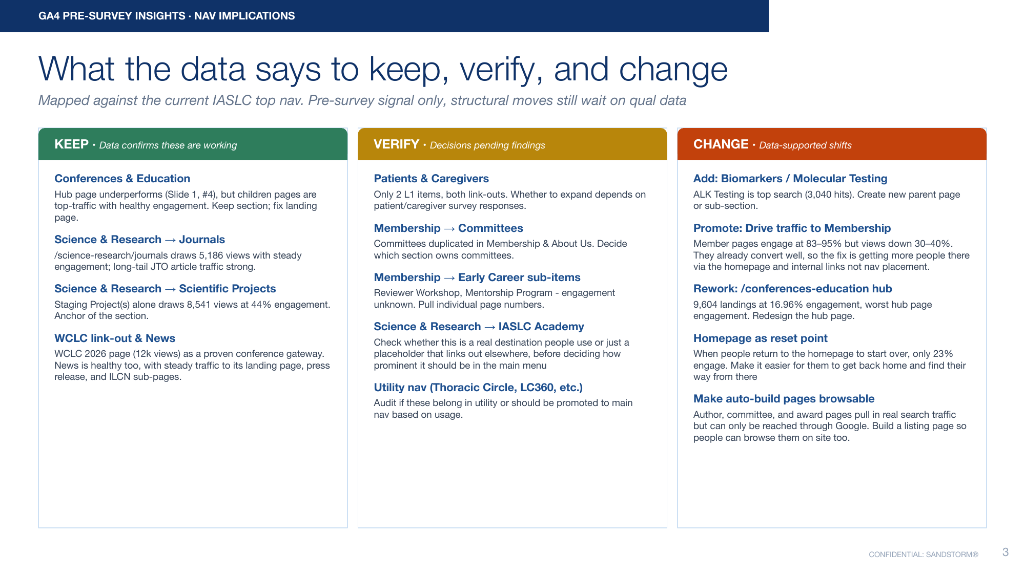
Keep, verify, change, mapped against the live navigation before any structural decision was made. The verify c
Keep, verify, change, mapped against the live navigation before any structural decision was made. The verify column is the important one: it names what the data could not settle.
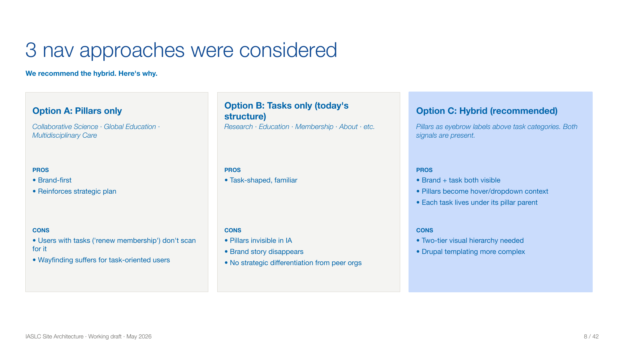
Three navigation approaches with the trade-offs stated. The hybrid was recommended, but the two rejected optio
Three navigation approaches with the trade-offs stated. The hybrid was recommended, but the two rejected options stay in the deck so the choice can be re-examined without rerunning the work.
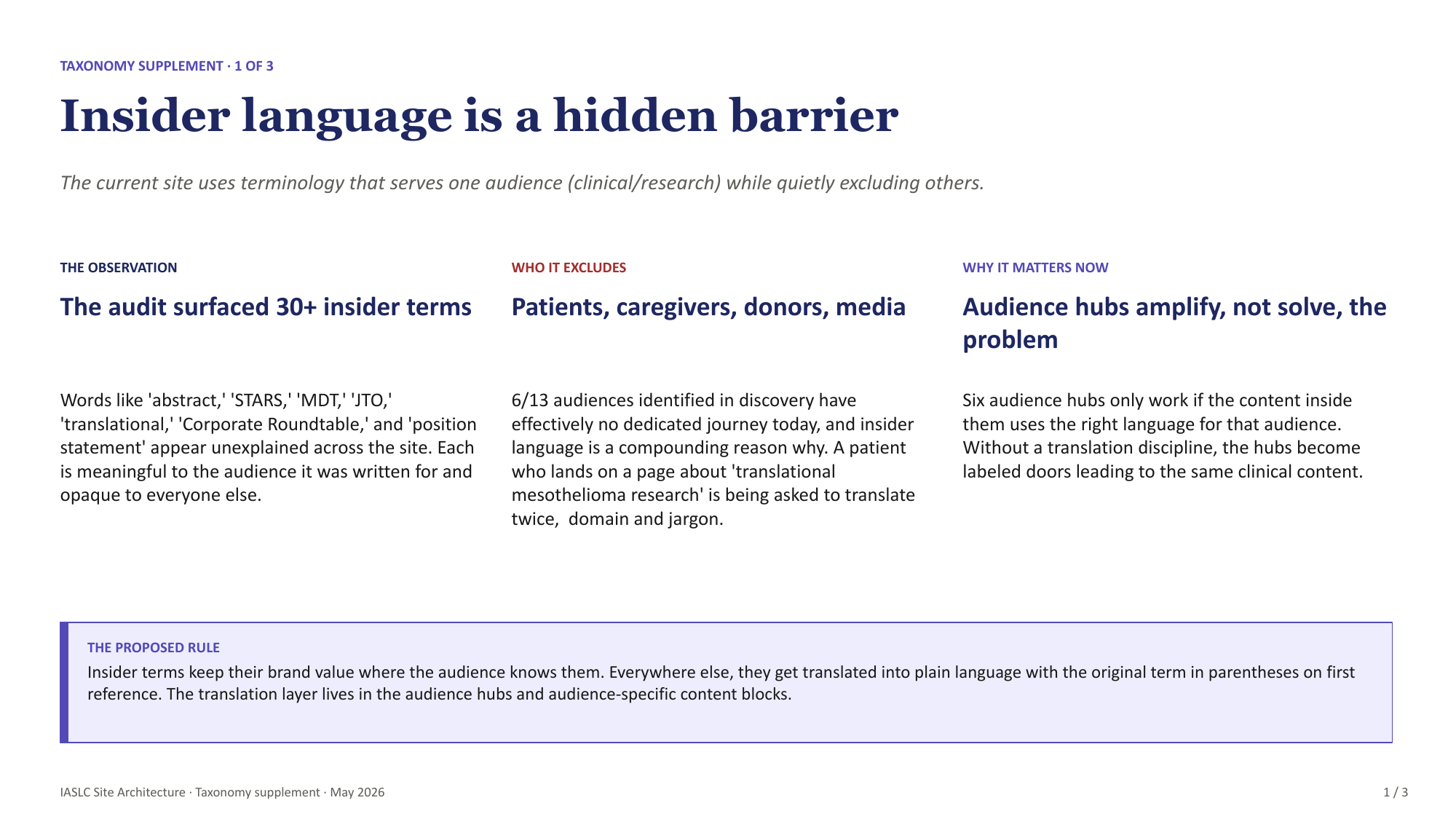
Insider language as a structural barrier. The audit surfaced 30+ unexplained terms, against 13 identified audi
Insider language as a structural barrier. The audit surfaced 30+ unexplained terms, against 13 identified audiences of which 6 had no dedicated journey.
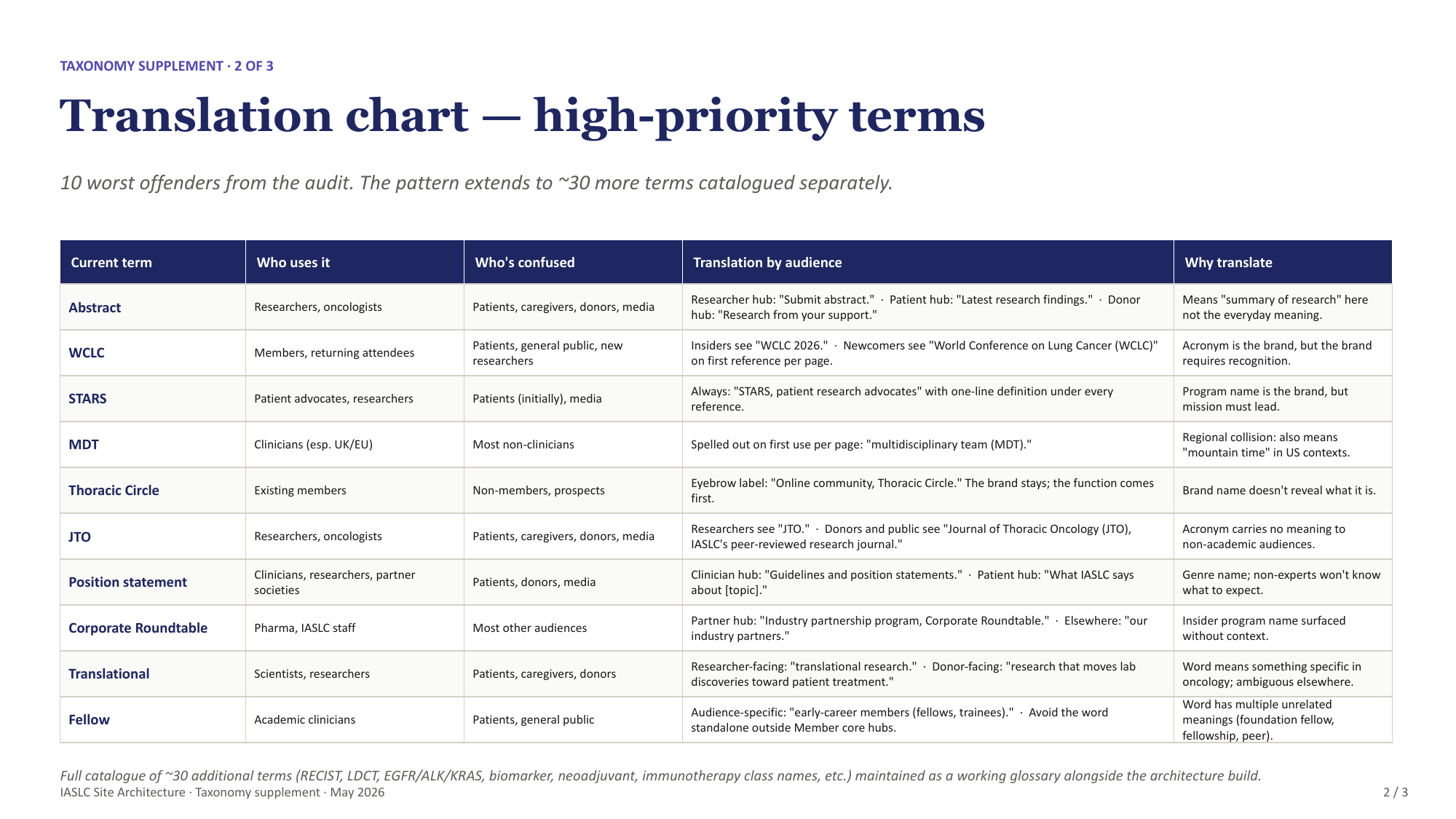
The translation chart. Ten terms, each with who uses it, who it excludes, and a per-audience rewrite. It doubl
The translation chart. Ten terms, each with who uses it, who it excludes, and a per-audience rewrite. It doubles as the source content for the phased multilingual rollout and ties plain language to WCAG 3.1.5 and EU MDR.
The patient flow, drawn to expose how little of it existed. The green steps are pages that had to be built; a
The patient flow, drawn to expose how little of it existed. The green steps are pages that had to be built; a patient arriving from search landed on a deep page with no hub to recover to.
Why the artifacts look like this

The contract was compressed from six months to two, and was likely to end before qualitative work finished. Every deliverable had to be defensible by someone who was not in the room when the decision was made, which is why the rejected options, the unresolved questions, and the evidence tier all stay visible on the page.

/ What the evidence flagged
09 / IASLC website redesign

Engagement by area,
against a 23% site average

Source: 12 months of behavioral data. The distance from the average is the finding.
Member landings
89
Homepage, mid-journey
46
Site-wide average
23
Chinese-language
21.4
Conferences hub
17
Top search term
3.2
Member pages engaged at 83 to 95% while views fell 30 to 40% year over year, which is a discoverability problem rather than a content problem. One biomarker term drew 3,040 internal searches and almost no clicks, because the page did not exist.

The ask was aggregation,
not more content

Weighted top-three ranking, 107 respondents across 31 countries.
Dashboard
86
Benefits in one place
84
Faster search
82
Content by role
80
Deadline calendar
79
Better mobile
62
Every top request pulls together something the site already has. 79% visit monthly or more, 16% find the site very easy, and 34% feel their specialty is served well. People who come back that often do not need onboarding. They need the site to get out of their way.
/ What the system produced
09 / IASLC website redesign

Decisions, each traceable
to its evidence

Nothing in the research forced a top-level restructure. All the pressure was inside the existing sections.

Decision
Evidence
Tier
Build a biomarker testing destination
3,040 internal searches on one term at 3.2% engagement
Change
Surface membership from the homepage
High engagement against falling reach year over year
Change
Rebuild the conferences hub
9,604 landings at 17%, the weakest top-tier hub
Change
Add plain-language research summaries
Three independent voices, one who did not need it
Confirmed
Build a nurses and allied health hub
Survey ranking plus interview detail on toolkit and CE
Confirmed
Build a patient front door and newly-diagnosed hub
Converged across survey, interviews, and the nav audit
Confirmed
Region and low-income-setting entry point
Two voices, two roles
Building
Frontline clinician exchange
Two voices, both from the same regional context
New signal
/ Where the system held under pressure
09 / IASLC website redesign

The evidence was thinnest
exactly where the stakes
were highest

Sample
7 of 107
Survey respondents were patients, survivors, or caregivers
Scope
4
Net-new pages, and the largest architectural change in the redesign, all for that group

Reported as qualitative signal and a recruiting pool. Never as a percentage. So I weighted interview recruiting toward the people the survey missed: non-members, patients, caregivers, and participants outside high-income settings.

The tiering did not solve this. It made it impossible to hide.
Recruitment as a research artifact

Each participant was selected against a documented gap, with the reason recorded. A rationale, not a list of whoever answered first.

Patient voice
Anchors the group every net-new page was built for
Non-member clinician
The why-I-have-not-joined view a member-heavy survey cannot reach
Journalist, non-member
Tests brand confusion: knows the conference, not the organization
Allied health
Covers a clinical role the sample almost entirely missed
Lapsed member
The only retention and why-I-left lens available
Caregiver
A different view from the patient's, and missing from the pool
The difference between a diverse-looking sample and a sample designed against a known weakness.
/ Designing for my own absence
09 / IASLC website redesign

The handoff was a deliverable,
not an afterthought

The test: can a designer who never sat in an interview tell how confident the research was, and know what would change the answer? Most handoffs answer neither.

Evidence-tiered architecture

Confidence per decision, visible without asking

IF / THEN flags

Open questions travel with the artifact

Moderator scripts

Written so a non-researcher can run a session

Recruitment tracker

Remaining interviews keep filling documented gaps

Translation chart

Positioned to become the content style guide

What I would do differently
  • Recruit the thin segment first, not last. The voices carrying the most weight landed last because I scheduled as people became available
  • Put the evidence tier in the architecture from version one, as a column in the sitemap rather than an annotation added after
Two cheap validation moves held the findings up: reading the survey at 82 responses and again at 107 to check the ranking did not reorder, and grounding the plain-language argument in accessibility standards the organization already has to meet, which moved it from taste to compliance.
/ Forward extension · applied concept
09 / IASLC website redesign

Synthetic panel calibration

A protocol I designed off the back of this project. I have not run it, and it was not client work. The open problem here is the thin patient sample: synthetic panels are sold as the fix for exactly that, and are least trustworthy exactly there.

Three conditions
  • A. Prompt-only. A role and some demographics in a prompt, which is what most tools on the market actually do
  • B. Evidence-grounded. Grounded in real behavioral data and published research, the version people claim works better
  • C. Real respondents. The survey responses, kept completely separate. The answer key

Measured on directional agreement, spread, whether it volunteers criticism, texture of answers, and accuracy by group. A against B is the interesting comparison, because it tells you whether grounding buys anything. Predictions get written down first.

The output is an admissibility rule, not a verdict
Hypothesis and question generation
Admissible
Pretesting whether a survey question reads
Admissible
Exploring rare or edge-case scenarios
Conditional
Priority ranking and sequencing
Never alone
Validating a concept or design
Not admissible
Anything about lived experience
Not admissible
A team can act on a table like this. They cannot act on a point of view. On consent: people agreed to take part in research, not to have their words used to build stand-ins that speak for them in studies they will never see. Until consent forms say otherwise, grounding stays on aggregate and published material.
Research is only as good as what survives the person who did it.