11

Four kinds of evidence,
one line of copy

Experience strategy · LoyaltyEstée Lauder Companies
UX ResearchExperience StrategyProduct & Design LeadershipAI & Insight Systems
The problem

Nine brands in the portfolio ran published loyalty programs. Active membership was climbing while the share of members who actually bought was falling, which is the shape of a program people join and then stop using. The programs were not the problem. Members reported that they did not always understand which benefits they were entitled to, and the ones who tried to claim them hit friction that read as a broken promise. A benefit a member cannot find, or cannot redeem, is indistinguishable from a benefit that was never offered.

My role

UX subject matter expert on all loyalty theme work. I did not run the individual studies. I set what the research had to answer, worked with the brand and global loyalty teams on what the evidence meant for the experience, and managed the researcher who ran the cart usability study that fed the synthesis.

Approach
  • Reviewed 15 existing ELC primary and secondary studies rather than commissioning a new one
  • Audited 27 current brand experiences across online and omnichannel
  • Analysed 100+ beauty and skincare sites for competitive pattern
  • Ran 2 lighthouse co-creation sessions alongside 6 ongoing regional insight forums
What it had to answer
  • Why members enroll and then disengage
  • Which benefits resonate across a genuinely diverse base
  • Where the experience breaks between promise and redemption
  • What a single brand can ship without a platform rebuild
Studies reviewed
15
Existing ELC primary and secondary research, synthesised rather than repeated
Experiences audited
27
Current brand experiences, online and omnichannel
Sites analysed
100+
Beauty and skincare experiences reviewed for competitive pattern
Brands in scope
9
Every heritage brand running a published, structured program
The brief was written to be implemented rather than admired. Every recommendation had to be something one brand team could ship inside a normal release cycle, because a recommendation that requires the whole portfolio to move at once never gets built.
/ The convergence
11 / Loyalty experience

Four signals, independently
collected, pointing one way

None of these were gathered to answer the same question. Contact logs come from customer service, verbatims from a post-purchase review tool, rage clicks from session data, and the cart study was a moderated usability test on a separate redesign. They converged anyway. Four instruments that were not designed to agree, agreeing, is the strongest form a finding takes.
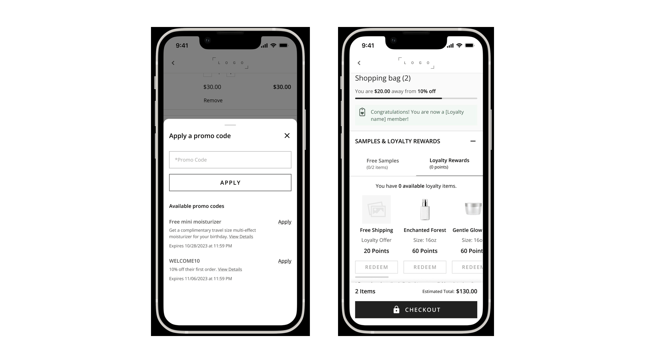
Two cart wireframes: a shopping bag with a progress note toward a discount and a combined samples and loyalty rewards panel, and the promo code sheet listing available offers with apply controls
The surfaces under testThe rewards panel and the promo code sheet, both above the checkout button. The progress note at the top, telling a member how far she is from the next discount, was the one element every participant noticed and understood correctly.Open full size
Customer service contacts
Reward redemption was the single largest driver of loyalty-related contacts, ahead of point expiry, birthday offers, and account setup. Members were calling because something they had earned would not apply.
Operational
Post-purchase verbatims
Review feedback described the failure in members' own words rather than ours. One read: “My loyalty coupon was unable to be applied to my order!” The exclamation mark is the finding.
Attitudinal
Session behaviour
Site audits found rage clicks on redeem buttons across several brands. Members pressing the same control repeatedly because nothing in the interface explained why it was not responding.
Behavioural
Moderated usability testing
Nine participants, mobile only, two counterbalanced scenarios, run by a researcher on my team on the standalone cart redesign. It reached the same redemption logic from a different direction entirely.
Evaluative
The cause was a single unstated rule. A reward could not be applied until a product was already in the bag, and nothing anywhere in the interface said so. Every member who hit it concluded the program was broken, which is the reasonable conclusion when a promise silently fails.
/ Inside the cart study
11 / Loyalty experience

Nine participants, two scenarios,
counterbalanced

Moderated, mobile only, run against the standalone cart redesign. Each participant met both a stackable-offer scenario and a conflicting-offer scenario, in alternating order so neither got the benefit of a warmed-up session. The study was not commissioned to investigate redemption friction. It found some anyway, and it settled a design argument the team had been having on taste.
Flow understood first pass
7/9
Navigated the loyalty rewards flow without hesitation or a wrong turn
Found promo codes unprompted
8/9
The ninth found it immediately once asked whether anything remained to do
Missed the offer limit
~half
Did not register the counter stating that only one offer could apply
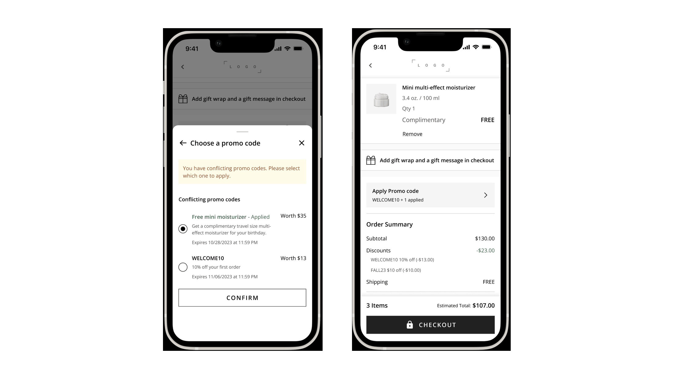
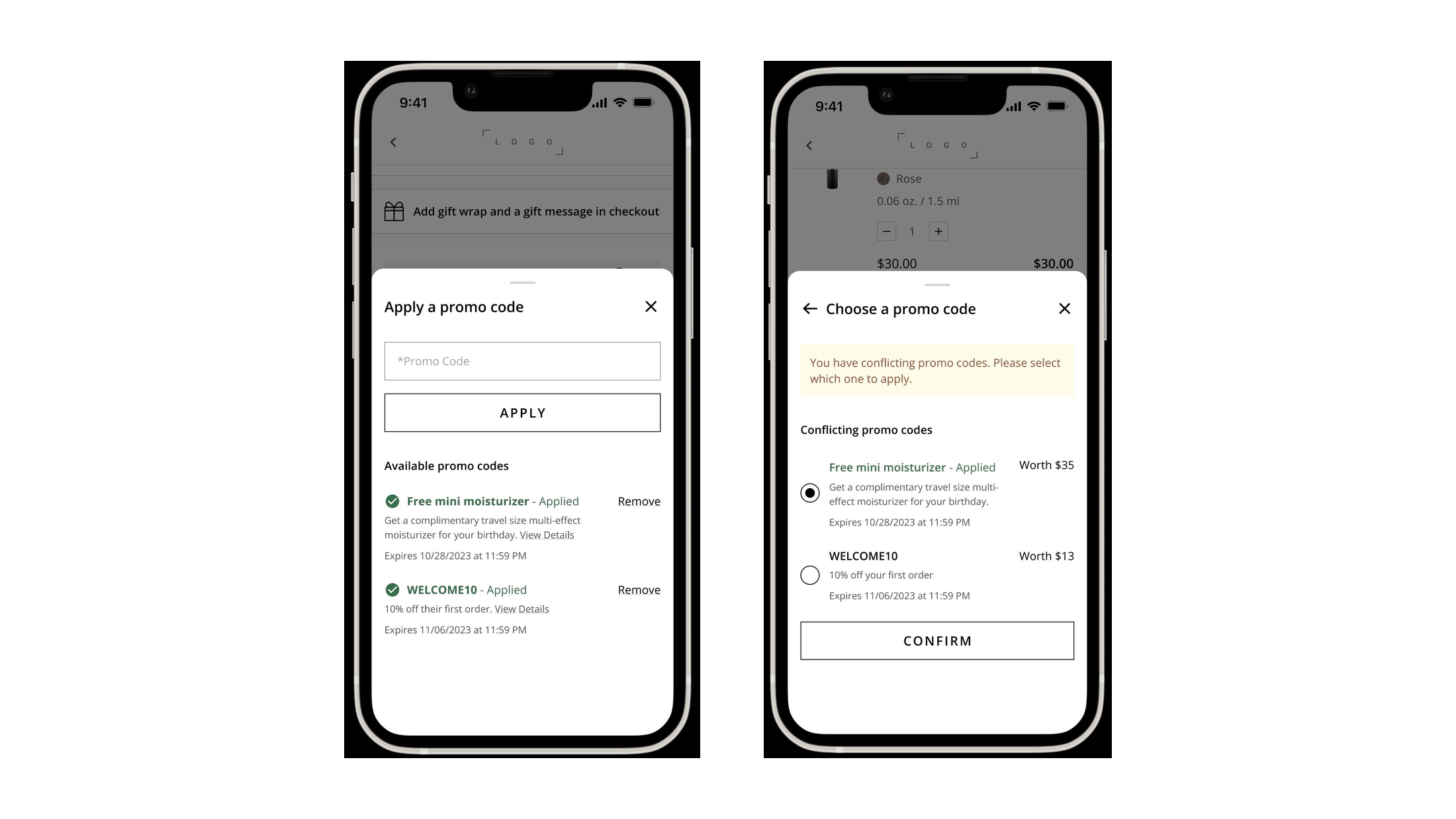
Two promo code wireframes side by side: the stackable scenario showing two offers both applied with remove controls, and the conflict scenario showing a warning that the codes conflict with radio buttons to choose one
Stackable and conflicting, both testedOne case where two offers combine, one where the system has to make her choose. Testing only the happy path would have missed the interesting half, since the conflict case is where a loyalty program either explains itself or looks arbitrary.Open full size
The conflict resolution screen showing two competing offers each labelled with its cash value, alongside the updated cart showing the complimentary product added and both discounts itemised in the order summary
Say what each one is worthParticipants who had never seen this pattern named it unprompted as the thing that made the choice easy. Without it, deciding between a free gift and a percentage off is arithmetic the shopper has to do in her head, at the last step before payment.Open full size
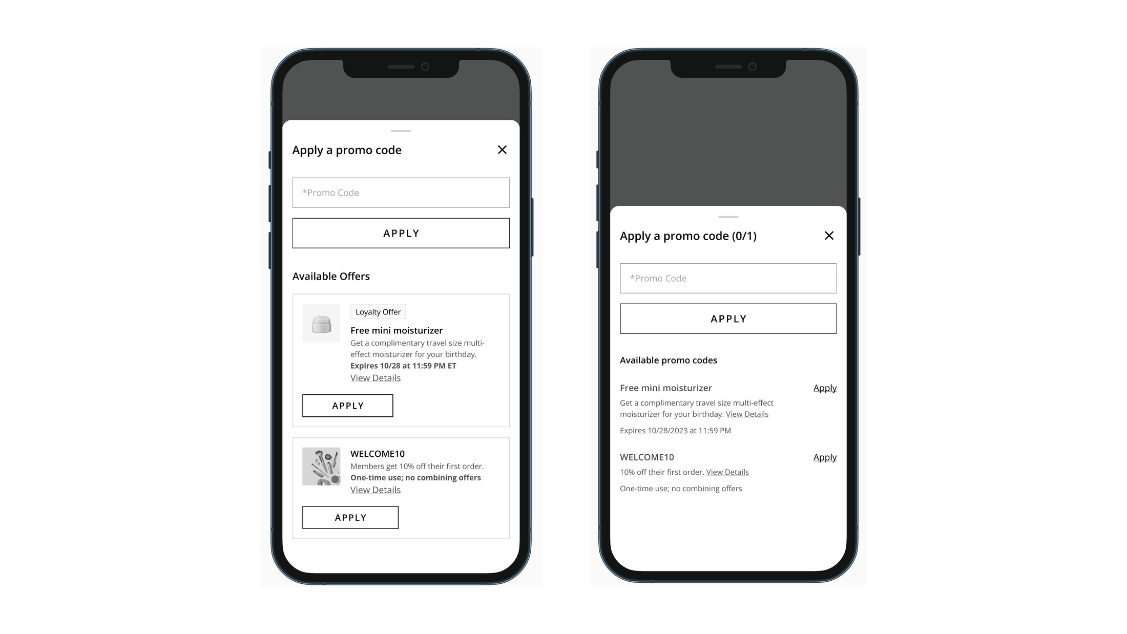
Two versions of the same offer list compared: a plain text list with apply links, and a version with product thumbnails, a loyalty offer badge and a bordered card per offer
The comparison that settled itThe same offers, two treatments. Participants preferred the right one consistently and for two specific reasons: the image told them what they would actually receive, and the badge told them the benefit existed because they were members.Open full size
The miss matters more than the successes. The counter indicating that only one offer could apply was doing load-bearing work and roughly half the participants never saw it. That is the same failure as the redemption rule one block up: a constraint the system knows and the interface does not say out loud.
/ The framework
11 / Loyalty experience

Three principles, so nine brands
did not need nine answers

Nine brands, several regions, and a platform none of them controlled alone. Findings addressed to everyone get implemented by no one, so the evidence was organised into three principles, each tied to a stage of the member relationship and to a metric those teams were already accountable for.

01 Seamless experiences

Discovery and engagement. Benefits stay visible across the journey rather than living only on the homepage and the program landing page. A member should never have to go looking for what she has already earned.

Measured on enrollment
02 Targeted engagement

Building relationships. First-party data used to make communications specific rather than frequent. The signal members responded to was recognition, not volume, and the two are easy to confuse when only volume is easy to increase.

Measured on purchase frequency
03 Relevant rewards

Promoting longevity. A mix of product, points, and spend-based rewards, so the program works for more than one kind of member. A single reward currency implicitly assumes a single kind of customer.

Measured on retention and loyalty sales penetration
Brands and regions attached their own initiatives and key results to the principles rather than receiving a list of tactics. The framework was the contract. What each team built against it stayed local, which is the only version of this that survives contact with nine different roadmaps.
/ The intervention
11 / Loyalty experience

The fix was one sentence

Four evidence streams had located the friction precisely enough that the response did not need to be a redesign. The rewards section on one North America brand gained a single line of copy above it, telling members that a product has to be in the cart before a reward can be selected. Nothing else on the page changed, which is what makes the result readable.

Loyalty contact rates, month over month
Contact reason
Before
After
Change
Reward redemption
0.23%
0.13%
Nearly halved
Tier point status or expiry
0.09%
0.09%
Flat
Birthday or anniversary offer
0.05%
0.04%
Flat
Benefits, sign-up, account setup
0.04%
0.03%
Flat
The unchanged rows are the point. If every loyalty contact category had fallen, the cause would have been seasonal, or an unrelated release, or noise. Three categories held within a hundredth of a point and the one the copy addressed dropped by nearly half. That is about as close to a controlled result as a live commerce site allows.
/ An open question
11 / Loyalty experience

The word on the door

One finding had nothing to do with mechanics. Across a review of 50 competitor sites, the overwhelming majority labelled the program in global navigation as some form of rewards. Only a handful called it loyalty. The portfolio ran the other way.

Program label in global navigation
50 competitor sites
Rewards
70%
Loyalty
14%
Other
16%
9 portfolio brands
Rewards
33%
Loyalty
56%
Other
11%

The hypothesis this raises is about framing rather than vocabulary. Rewards names what the member receives. Loyalty names what the brand is asking her for. Member feedback categories in the review tool referenced rewards and points constantly and loyalty almost never, which suggests the industry convention tracks how customers already talk. There is a plausible search consequence too, since someone looking for a program searches with the word she already uses.

Filed as a hypothesis, not a finding, and the recommendation was written that way: audit terminology for consistency sitewide first, then test whether the word itself moves sentiment before anyone commits to a rename. Fifty sites establish a convention. They do not establish that the convention works.
/ What it produced
11 / Loyalty experience

Ten things to build,
seven things to find out

The brief separated what the evidence had settled from what was still a bet, and said which was which on the page. Mixing the two is how strategy documents lose the trust of the teams that have to build from them.

01 Ten foundational elements

Enrollment, sitewide visibility, program marketing pages, member exclusives, redemption requirements, order confirmation, exclusive offers, time-sensitive communications, CRM triggers, and point redemption. Near to mid-term, each one shippable by a single brand team.

02 Seven test-and-learn pilots

Extended return windows, members-only pricing, service integrations, bonus point mechanics and others. Each written with an objective, a scope, the resources it would need, and the KPIs that would settle whether it worked.

03 One operational plan

Every element mapped against every brand with a current status, so the next conversation started from what was already done rather than from the framework again. The plan is what turned a point of view into a queue.

A benefit a member cannot find is indistinguishable from a benefit that does not exist. Most of this work was making promises legible.