Search across five brands,
two viewports
Every brand in the portfolio had built its own site search independently. The interactions diverged, the predictive overlays diverged, and nobody could say which decisions were deliberate and which were inherited. Product wanted a single global standard for search, and wanted it defensible rather than preferred.
Led the analysis end to end as Director of UX Strategy and Analysis: framed the questions, wrote the hypotheses before the audit, graded the experiences, and delivered the global recommendations that fed the design and A/B roadmap.
- Structured expert review, desktop and mobile evaluated separately for every brand
- Competitive benchmark across five commerce sites, in and out of category
- Graded against Baymard Institute search and autocomplete guidelines
- Three hypotheses written before the audit, then tested against what the audit found
No participants and no sessions. This is expert evaluation against an external standard, run to generate testable hypotheses rather than to settle them. The study was paired at the time with internal search analytics; those files did not leave the company with me, so no figures from that leg appear here.
The richest thing we were building on mobile was the thing nobody could see.
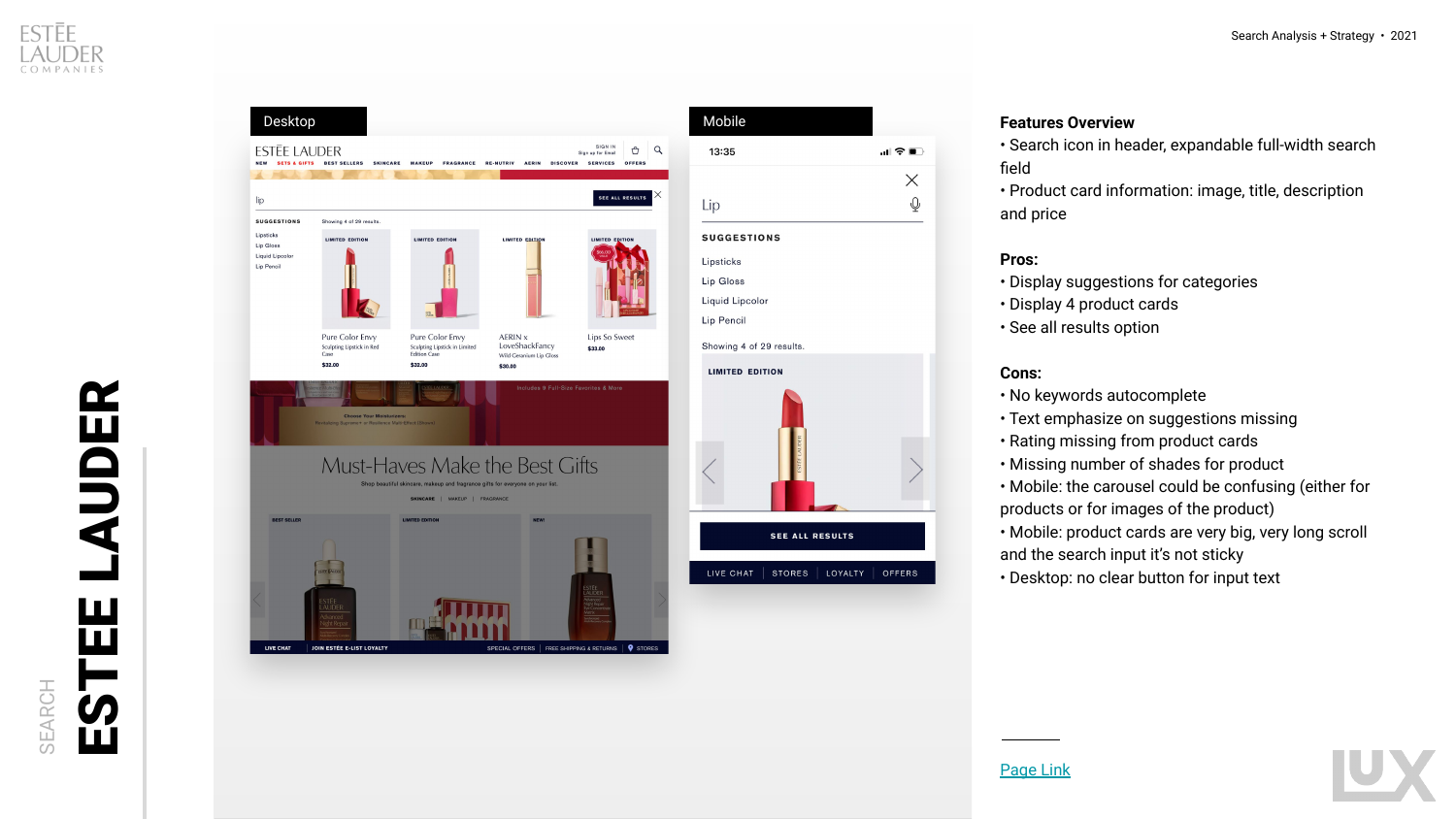
- On a phone, the keyboard opens with the search field and covers the predictive product cards below it
- Most people submit the query before scrolling, so the cards are rendered and never viewed
- Every brand in the portfolio was investing design and engineering effort in that space anyway
- The same overlay, on desktop, is fully visible and genuinely useful
- It reframed the mobile question from how many product cards to whether product cards
- It made the case for text-first predictive results on small screens
- It turned a styling debate into a spend question with a clear answer
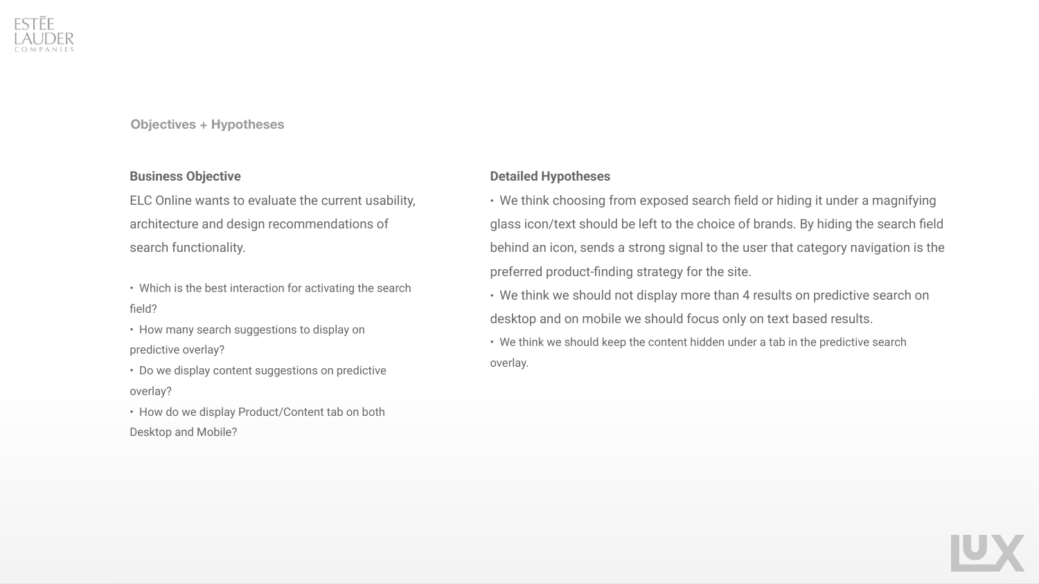
Four questions, three hypotheses,
committed to in advance
Stating the position first is what makes an expert review checkable. Two of the three held, one was overturned by the evidence, and the one that was overturned is the reason the recommendations changed the roadmap rather than confirming it.
Exposed field or magnifying glass icon should be left to each brand, because hiding the field signals that category navigation is the intended path.
Three of five competitors used an exposed field, two used an icon, and neither produced a worse experience.
No more than four product results in the predictive overlay on desktop, and on mobile focus on text results only.
Four became the portfolio standard. The mobile half went further than the hypothesis: not fewer cards, but a different model entirely.
Editorial and story content should sit behind a tab in the predictive overlay rather than alongside products.
Exposing content made the overlay harder to read, so the tab survived, but the reasoning changed from hierarchy to legibility.
Five sites, six attributes,
both viewports each
Two brands from the portfolio, two beauty competitors, and one furniture retailer included deliberately: the goal was to see how search behaves as a commerce pattern, not just how beauty does it. Every site was walked twice, once on desktop and once on a phone, and scored separately.
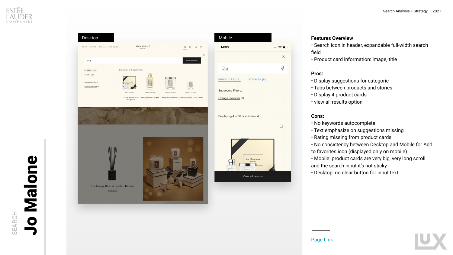
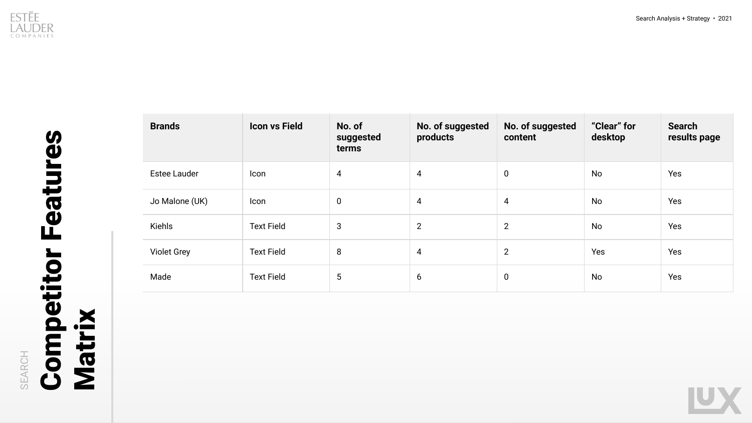
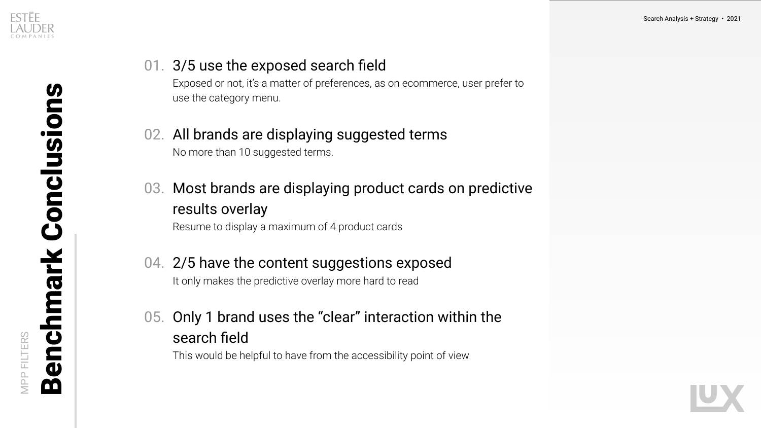
Opinion is cheap in an audit.
The standard is what makes it hold.
Grading against published Baymard guidelines rather than personal judgment is what let this survive a room full of brand teams who each believed their own search was fine. When a finding is a guideline violation, the conversation moves from whether to when.
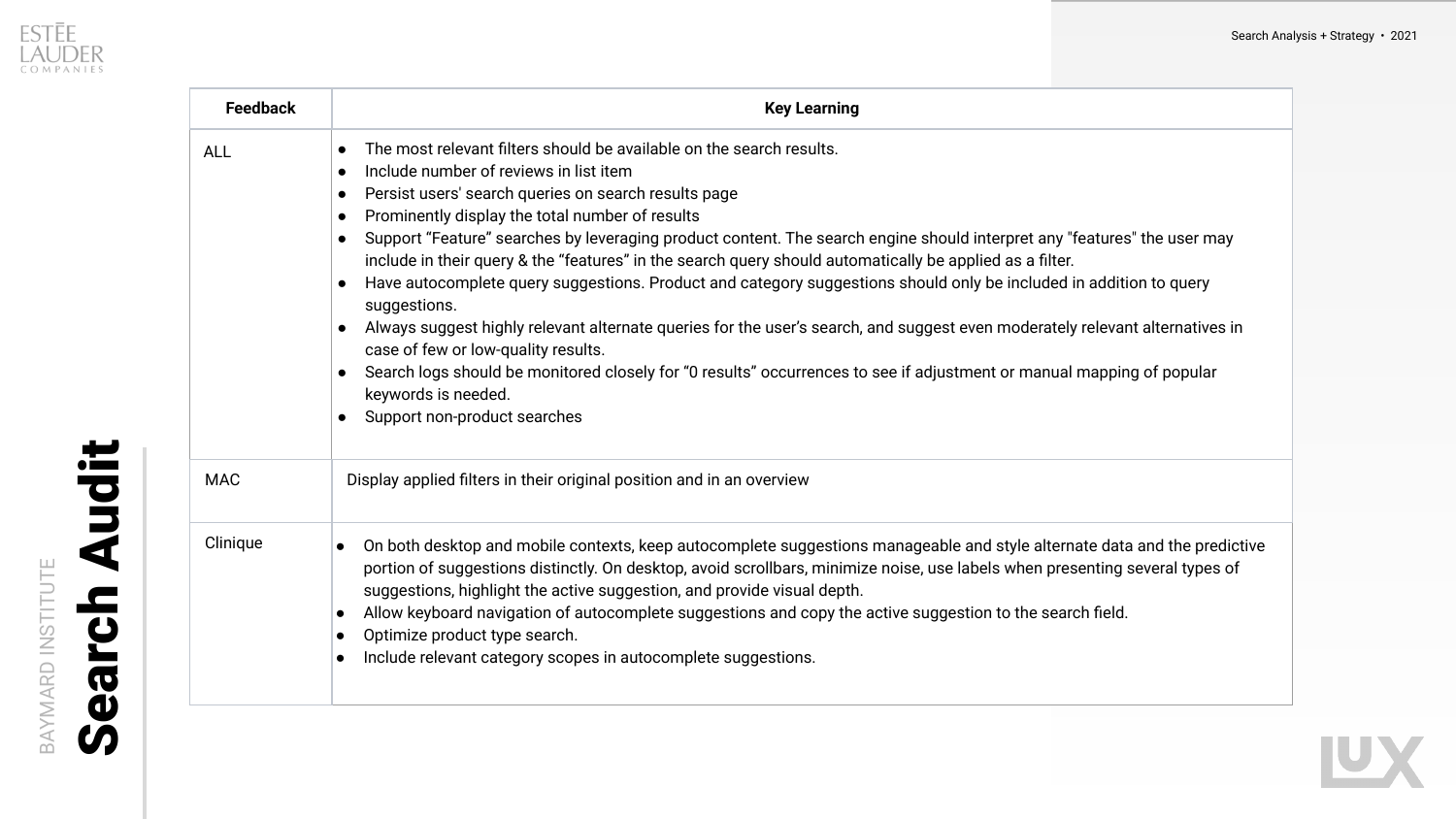
Five decisions, applied
across every brand site.
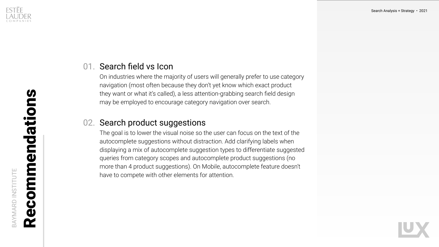
Each one is a default with a stated reason, which matters in a portfolio: brand teams can deviate, but they have to say why, and the reason is on the record for the next person who asks.
Exposed field or icon is a brand decision. Neither harms the experience, because category navigation is where most product discovery starts on a beauty site.
Ten suggested terms as the ceiling, scaled to how many categories and products the brand actually carries.
Four maximum on desktop, to keep focus on the query. On mobile, text first, because the keyboard covers the cards and people submit before they scroll.
A tab to switch between products and editorial, matched to the same count as products. Exposing both at once made the overlay unreadable.
Drop add-to-bag from the overlay, since size and shade selection happens on the product page anyway. Add ratings, which users treat as a filter rather than a detail.
Three things this study
could not settle
Expert review generates hypotheses well and confirms them badly. The mobile keyboard finding is the strongest thing here and it is still an inference from interaction design, not an observation of behavior. Five unmoderated sessions per viewport would have settled it in a week, and I would build that in from the start now.
Five sites is enough to see a pattern and not enough to weight it. Including a furniture retailer was the right instinct, and one out-of-category site out of five gives that instinct very little to stand on.
The recommendations shipped as a standard without a defined success metric per decision. On the benchmark audit I ran later, every activation carried its own measurement plan, which is the direct lesson from this one.