One beauty profile behind every touchpoint
The commerce platform was personalized in a dozen places and connected in none of them. Virtual try-on knew your shade. The diagnostic quiz knew your concerns. Your account knew what you had bought. A shopper could scan her face, get a shade match, walk to a category page, and filter through a panel that had never heard of any of it. Every feature was personal. The experience was not.
Owned the research and wrote the site-wide strategy: which surfaces personalize, what each shows in each account state, and which data source wins when two disagree. Written for every brand on the platform, so it had to hold without knowing which brand was reading it.
- Inventoried what the platform could already personalize against what it actually did
- Named every surface where a saved attribute should change what a shopper sees
- Ranked the data sources so conflicts resolved the same way everywhere
- Specified each surface in three account states rather than assuming a logged-in user
- Offers, editorial and inline content
- Pop-ups, modals and cart overlay banners
- Product partials, category and product pages
- Navigation and menus
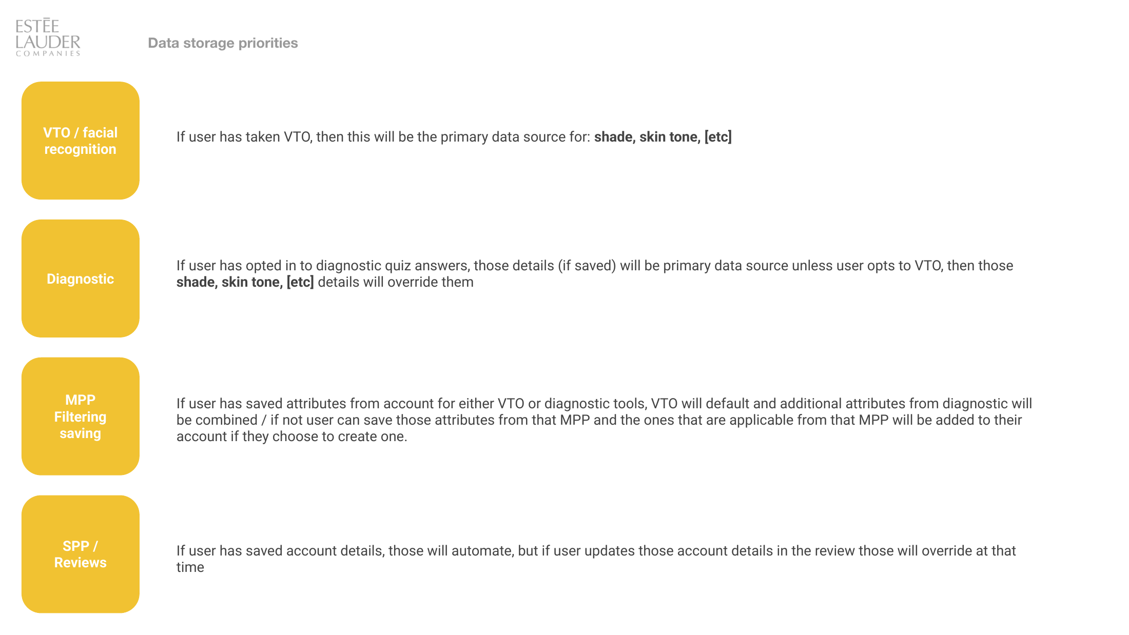
Which source wins when
two of them disagree
This is the piece the platform did not have. Four features were each collecting attributes about the same shopper, and nothing said what happens when the quiz says one thing and the face scan says another. Without a stated order, every team building a personalized surface would invent their own, and the answers would drift apart.
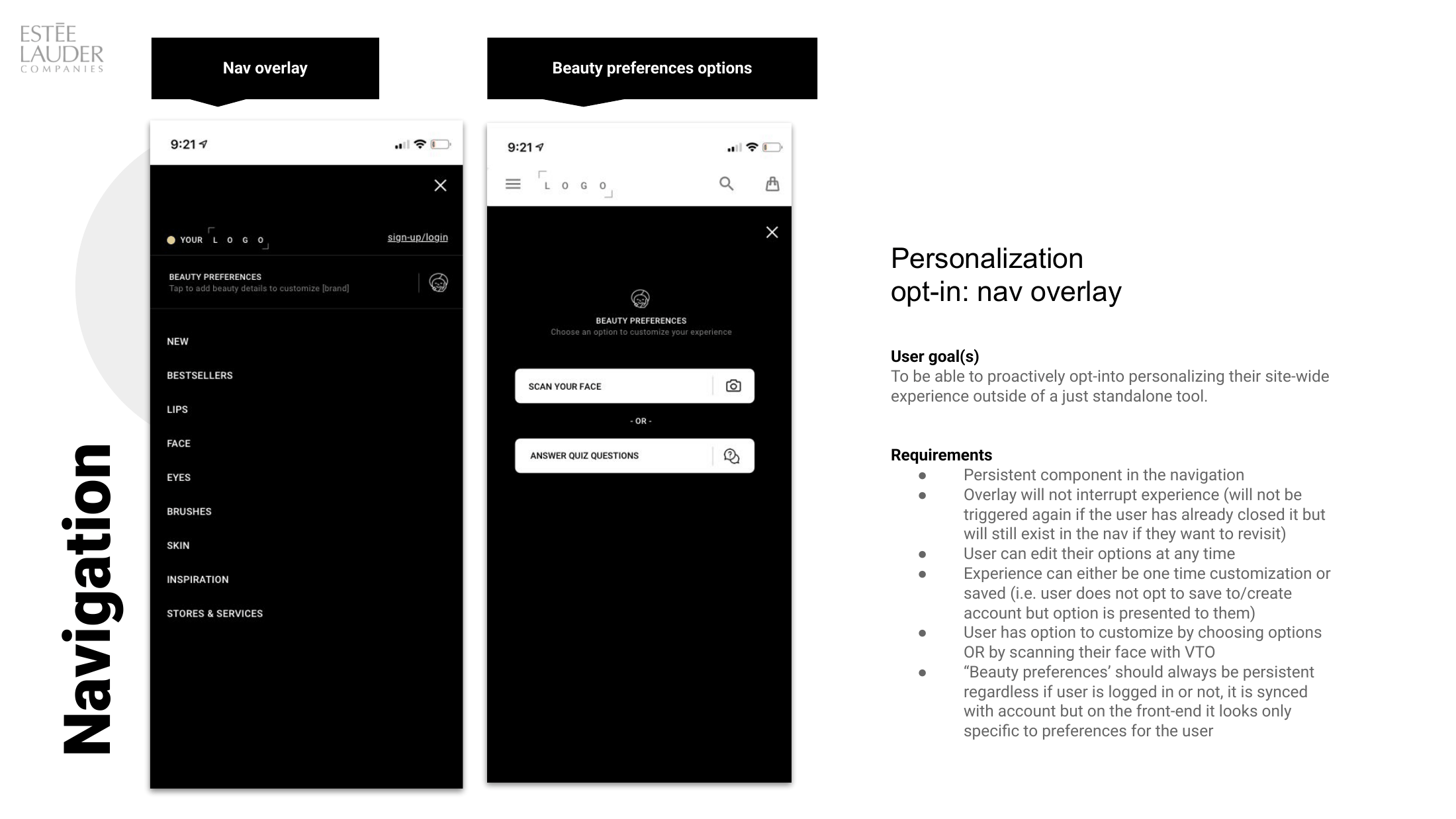
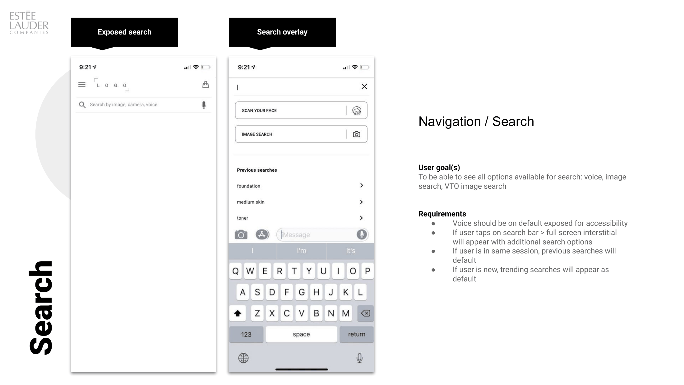
A door on every page,
and no account required
Personalization lived inside standalone tools, so a shopper had to already want it before she could find it. The strategy moved the entry point into the navigation, the homepage, and search, then set the rules that keep an offer like that from becoming an interruption: it does not re-trigger once dismissed, it stays reachable in the nav, and it can be used once without an account.
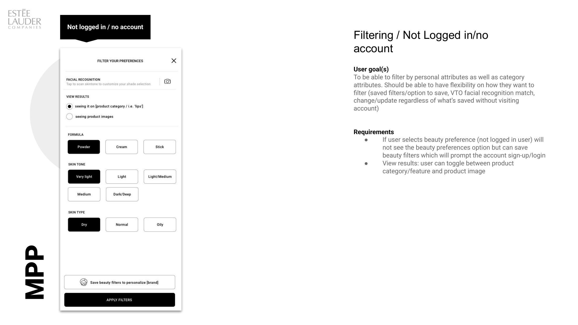
The same panel, specified
for who is actually looking at it
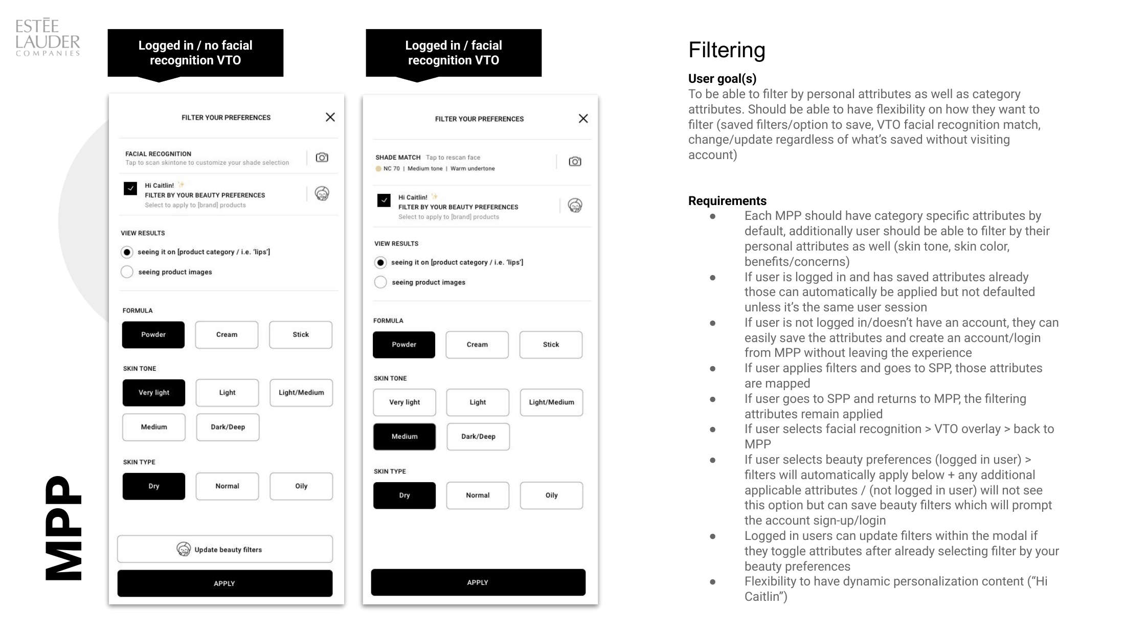
Most personalization specs describe the signed-in case and leave the rest to whoever builds it. The category filter panel was written three times instead: anonymous, signed in, and signed in with a face scan on file. Each state gets the same category attributes and differs only in how much it already knows.
The quiz and the scan stop
being competing products
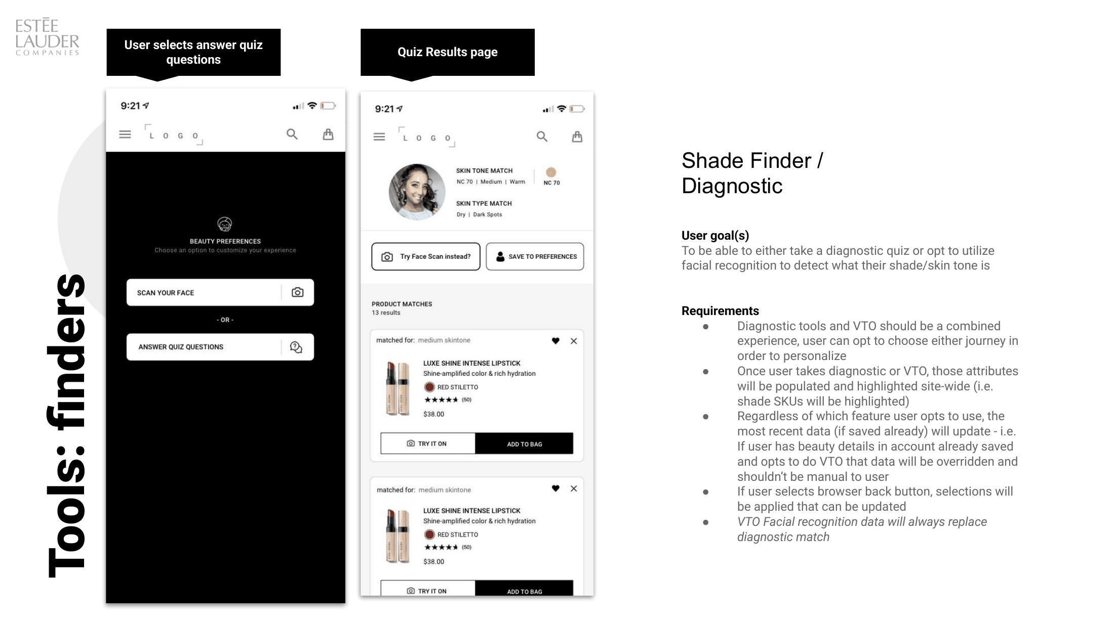
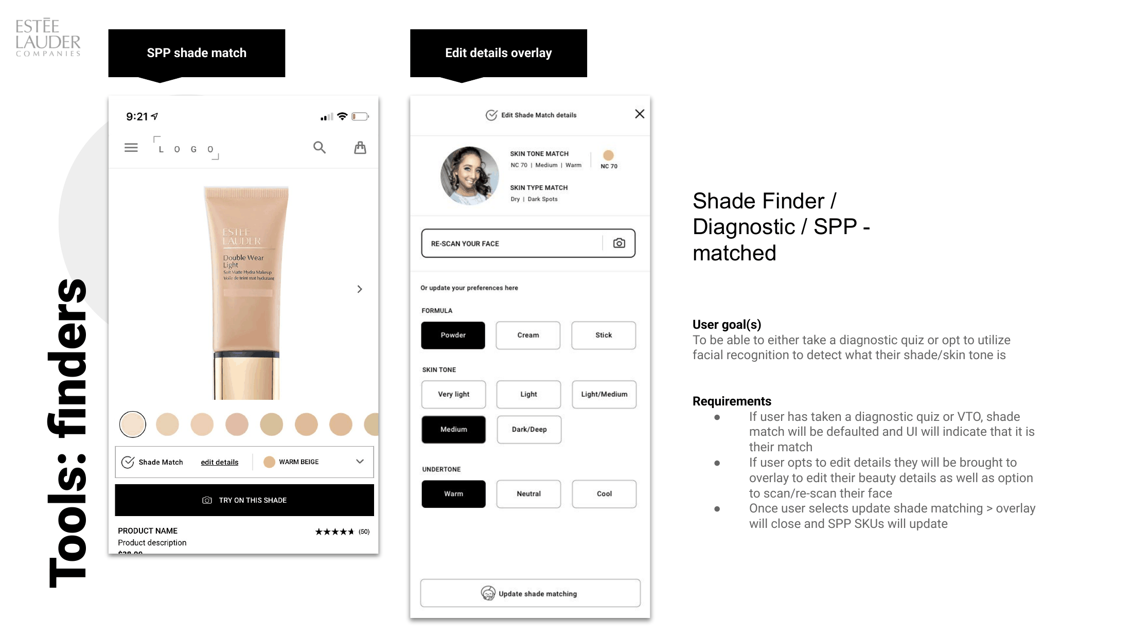
Diagnostic quizzes and virtual try-on had been built as separate tools with separate results pages, leaving shoppers holding two answers and no way to tell which one the site believed. The spec folds them into one experience with two entrances, and pushes the result outward so shade matches surface on product pages instead of dying on a results screen.
A specification teams could
build against without me
The document was not a vision deck. It was a working spec: user goal, requirements, and wireframes for each surface, plus one data model the surfaces all answered to.
Four sources ranked in a stated order, so two features could never leave a shopper with two conflicting answers about her own skin. Every surface downstream inherits it rather than negotiating it.
Requirements written for anonymous, signed in, and signed in with a scan, on every surface that was specified. The anonymous case was written first on purpose, because it is the one that usually gets dropped.
Ten surfaces named, four specified. Reviews, offers, chat, sampling and alternate imagery were scoped and left open, so the next person could see exactly where the work stopped and what it stopped short of.