When the analytics said win
and the sessions said no
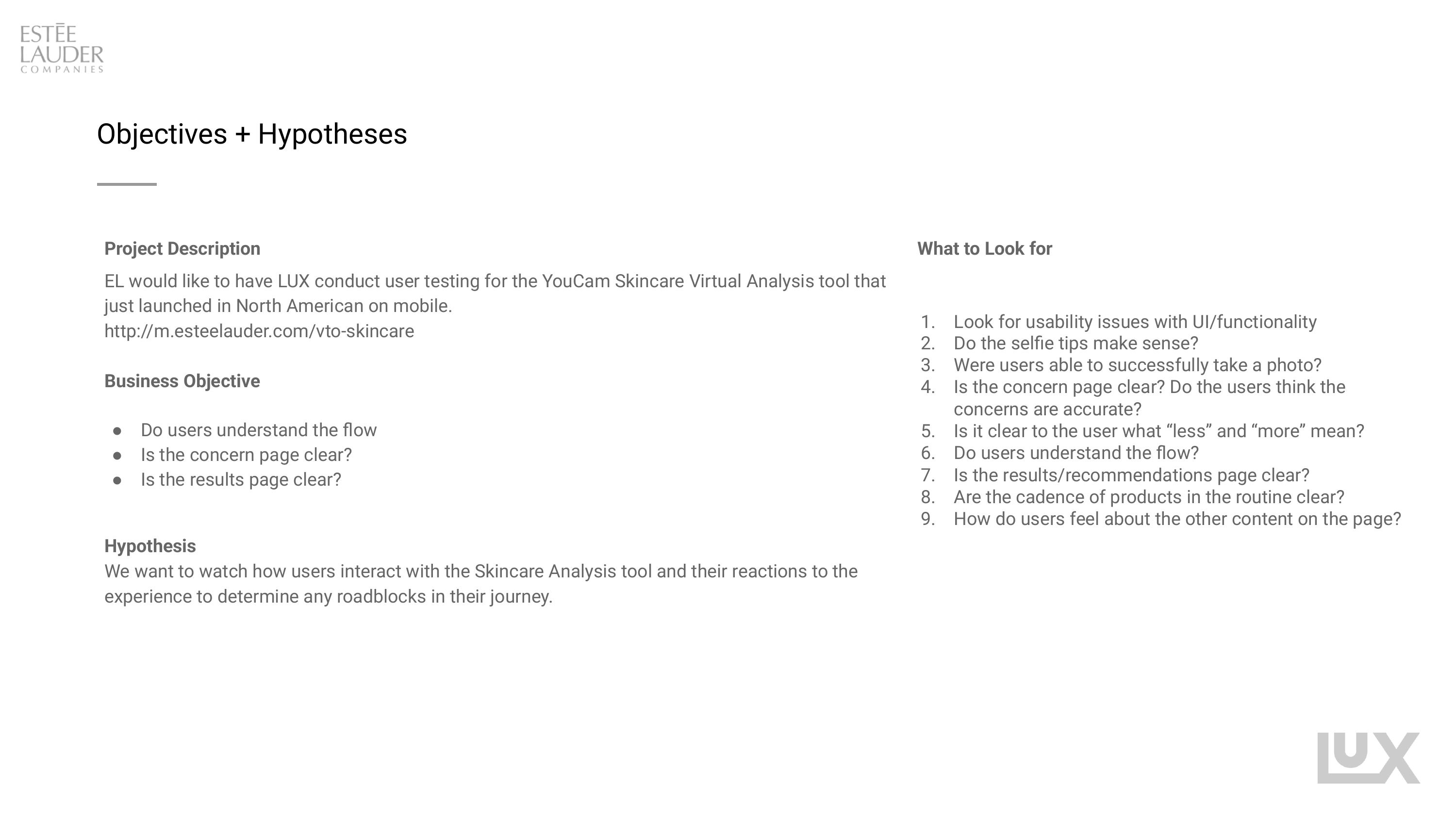
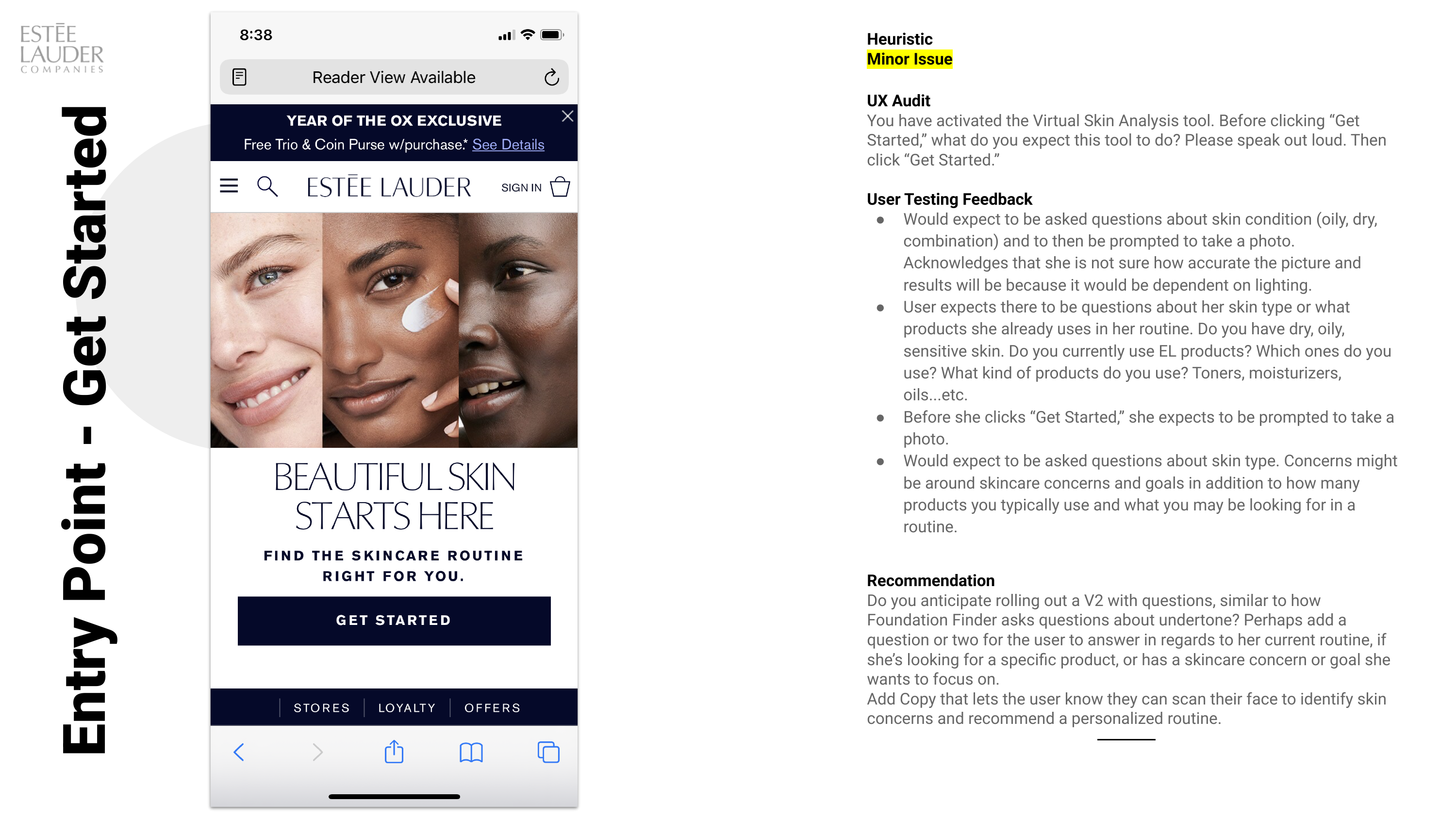
A mobile-only AR skin diagnostic had just launched in North America. The user scans their face, the tool identifies skin concerns, and it returns a personalized product routine. The launch numbers were excellent and nobody had watched anyone use it. Product wanted to know what to build in v2.
Wrote the study and the task script, shared moderation with a researcher on the product side, and authored the recommendations and the prioritized requirements that went to the product team.
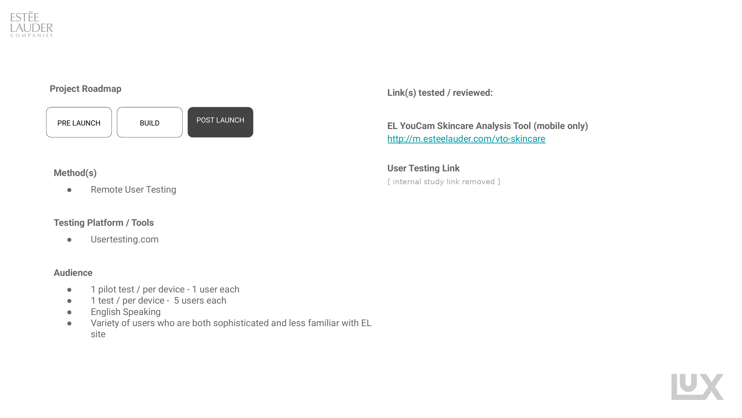
- Analytics reviewed first, then twelve remote sessions run against what the numbers claimed
- Two pilot sessions, one per device, before any real session ran
- Ten sessions total, split across mobile and desktop entry
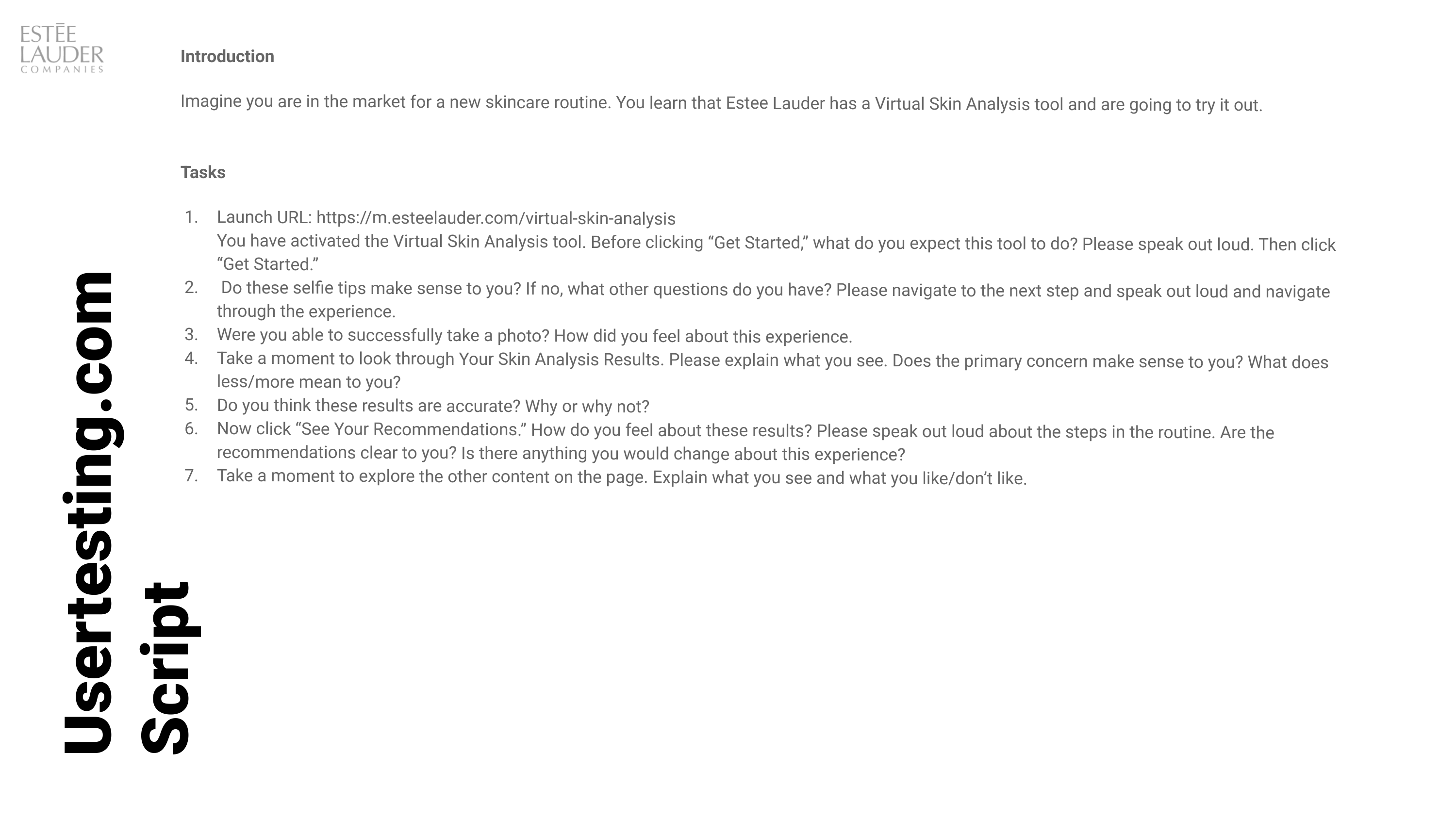
- Seven-task script, think-aloud, unmoderated on UserTesting
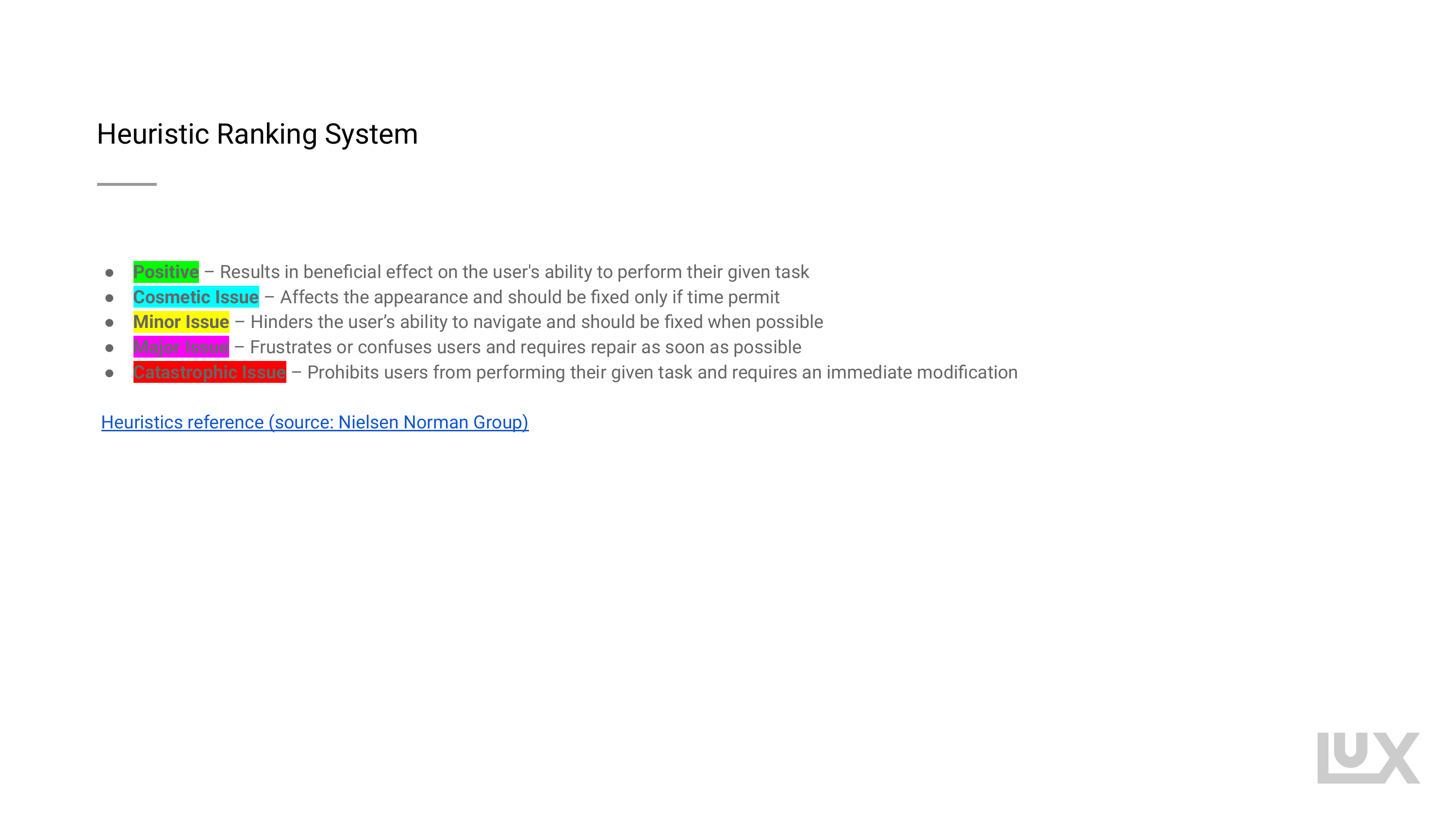
- Findings graded on a five-level severity scale tied to Nielsen Norman heuristics
Not a budget compromise. The plan was three rounds of five: find the surface problems, fix them, then test again for the deeper ones. Multiple small rounds change a product; one large round documents it.
The personalization tool was not personalizing, and the metrics could not see it.
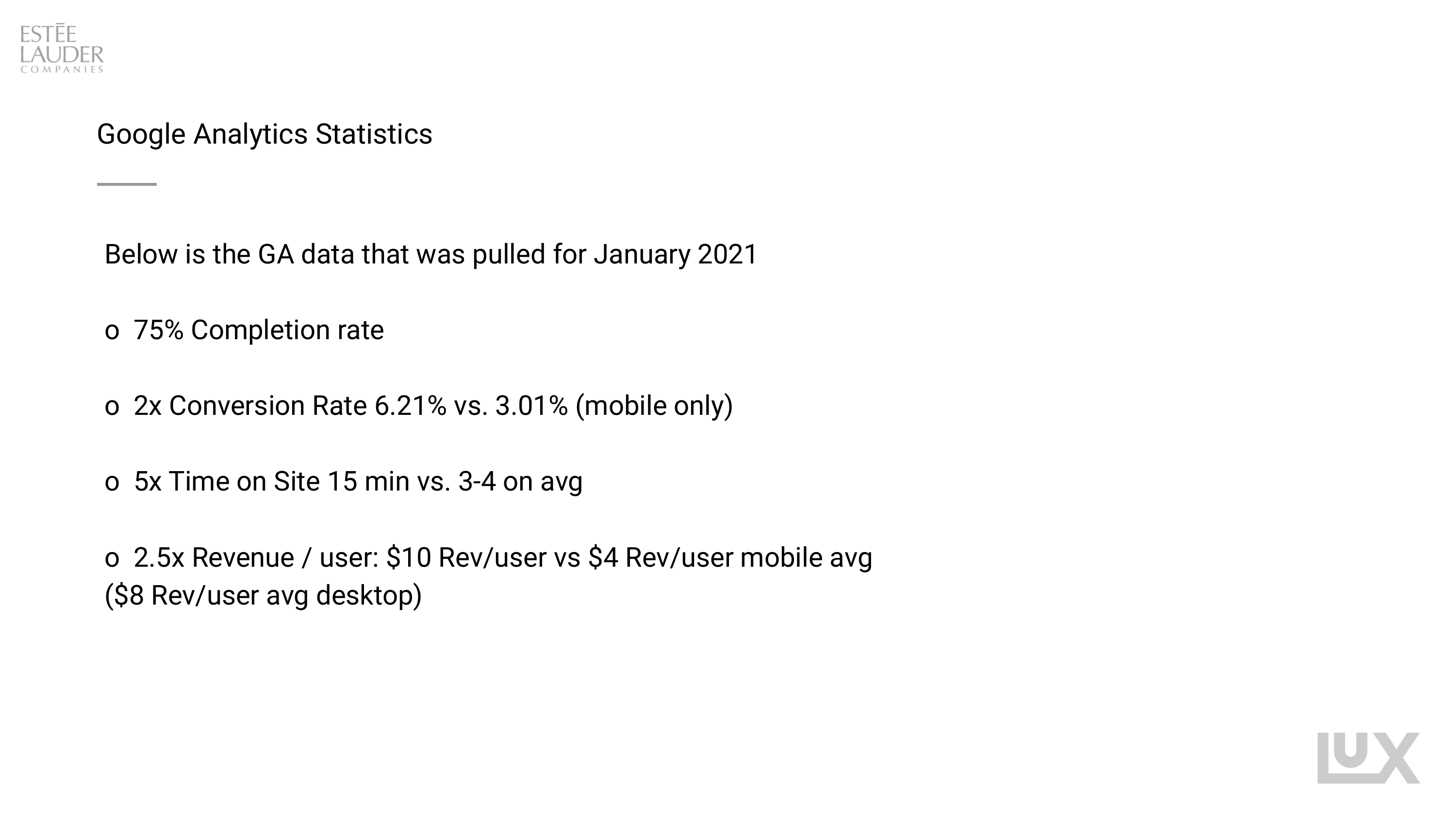
- Three quarters of people who started the scan finished it
- Conversion roughly double the mobile baseline
- Time on site around five times the site average
- Revenue per user roughly two and a half times the mobile average
- Every participant in the mobile arm received an identical recommended routine
- The same defect appeared in the separate quiz-based finder, returning the same results to everyone
- Participants could not work out how to trigger the capture, because there is no button
- Five recommended products read as an upsell rather than a routine
The lift was real. The causal
story attached to it was not.
These figures were being read internally as evidence that the tool drove conversion. It is worth saying plainly what they can and cannot support, because the gap between those two things is where the study earned its keep.
People who choose to scan their face for a skincare routine are already further along than the average visitor. Comparing them to the site baseline compares intent, not the tool. The honest read is that the diagnostic identifies high-intent shoppers extremely well. Whether it creates them is a different question and this data cannot answer it.
A holdout: the same high-intent segment, half routed to the diagnostic and half to the existing quiz, measured on the same window. Without that, every one of these multiples is a description of who showed up.
Twelve sessions, seven tasks,
five severity levels
The tool was mobile-only, but people reach a mobile-only tool from a desktop browser too, so the sample was split to see both. The findings below come from the mobile arm unless stated otherwise, which is where the substantive failures were.
This was a two-person study. I wrote the script and the recommendations; session moderation was shared with a researcher embedded on the product side. Participant imagery from the sessions is deliberately excluded from this page.
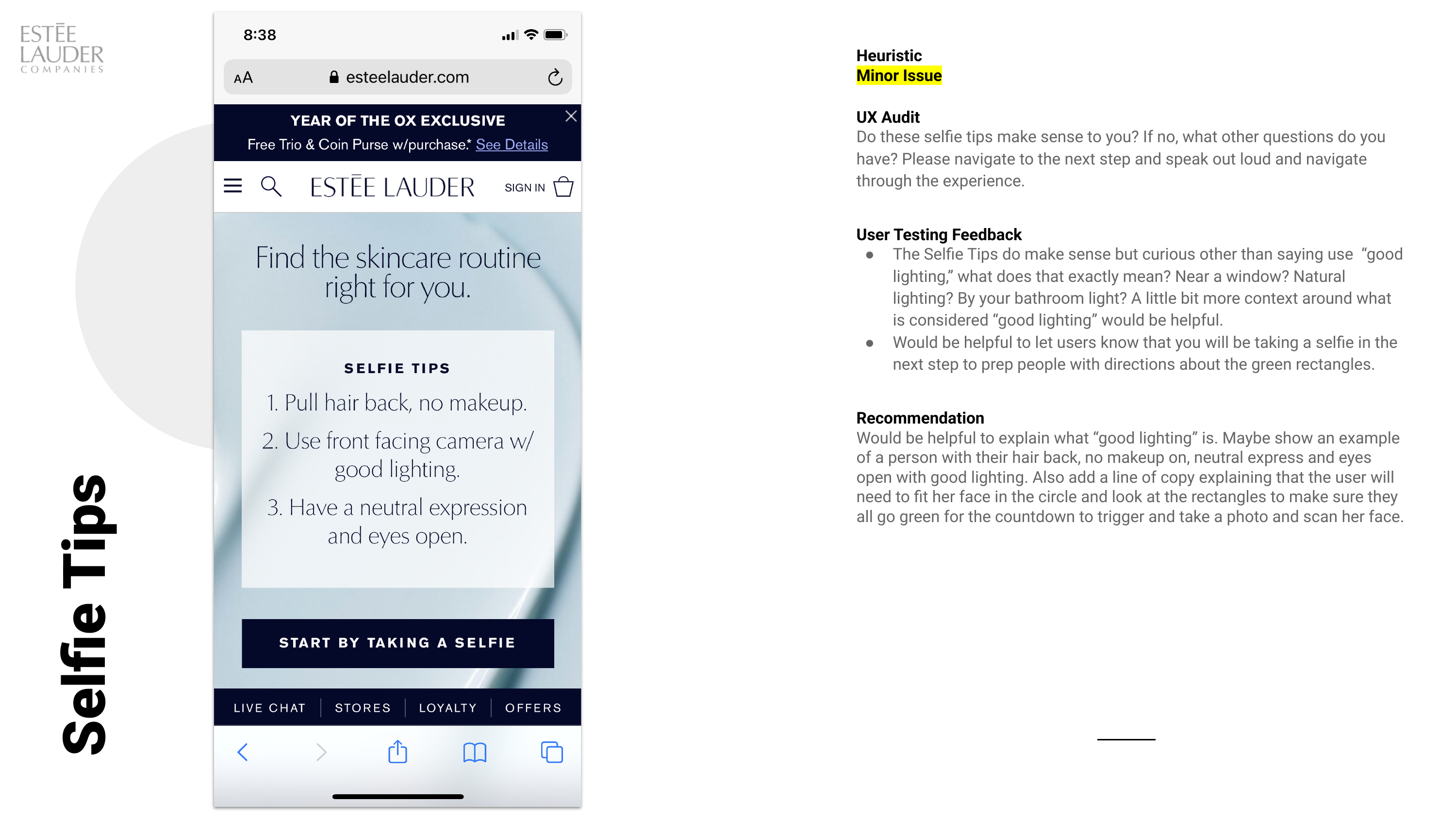
Running one pilot per device caught script problems before ten sessions were spent on them. It is the cheapest quality control in unmoderated research and the step most often skipped.
The camera step was the wall
Everything upstream of the scan was a minor issue. The scan itself was major, and it was major for a reason that only shows up on a phone: the interface had removed the one control people were looking for.
There is no shutter button. The photo fires on a countdown once the face is centered closely enough. Participants tapped the screen repeatedly trying to find the trigger, then recentered, then tapped again.
Three indicators are supposed to turn green to signal the system is ready. In session they were not noticeable. The affordance existed and did not communicate.
At least one participant expected to use portrait mode rather than the front-facing camera, which is a reasonable read of what a beauty brand would ask for and produces an unusable input.
People believed the diagnosis
and rejected the prescription.
The analysis screen was the one part of the flow graded positive. Participants found the concerns credible, liked that each one named a cause in a single sentence, and engaged with the severity scales. Then the routine arrived and the trust went with it.
Participants read a five-product recommendation as a sales target rather than advice. Several said outright they would not replace an entire regimen at once, and those with sensitive skin named a real risk in doing so. The recommendation that followed was two or three products, with samples offered as the low-commitment entry.
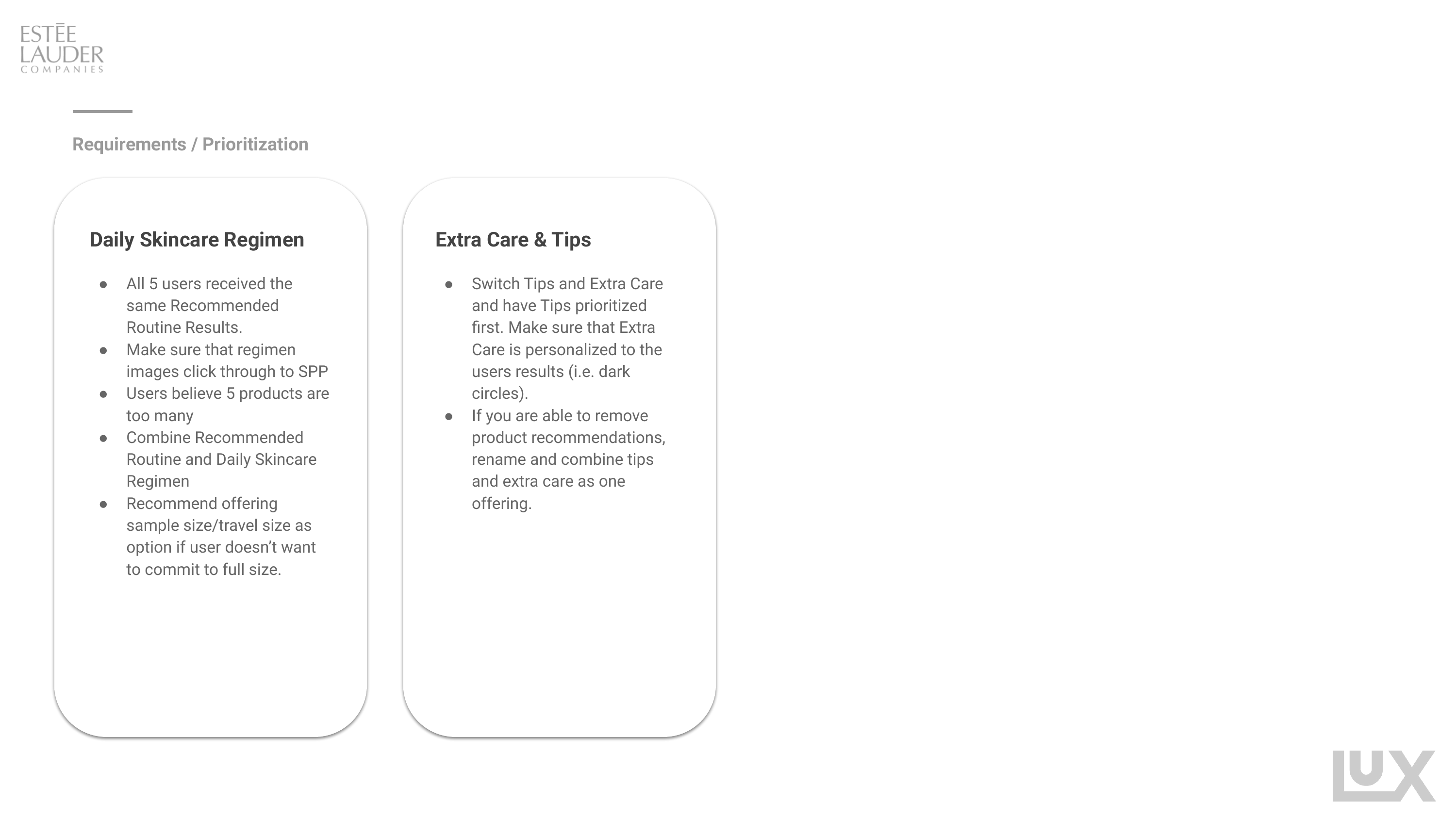
The recommended products and the daily regimen were separate sections, so nothing connected step one to the cleanser. The page looked like a product grid rather than a sequence. Merging them was the structural fix.
No add-to-bag on the results, and regimen images that did not link through to the products they showed. The tool ended on a wall.
Every participant in the mobile arm received the same recommended routine. Five different faces, five different stated concerns, one identical output. The same defect was present in the quiz-based skincare finder, which also returned identical results regardless of input.
Two personalization surfaces, both shipped, both returning a constant. Neither had been caught because both were converting.
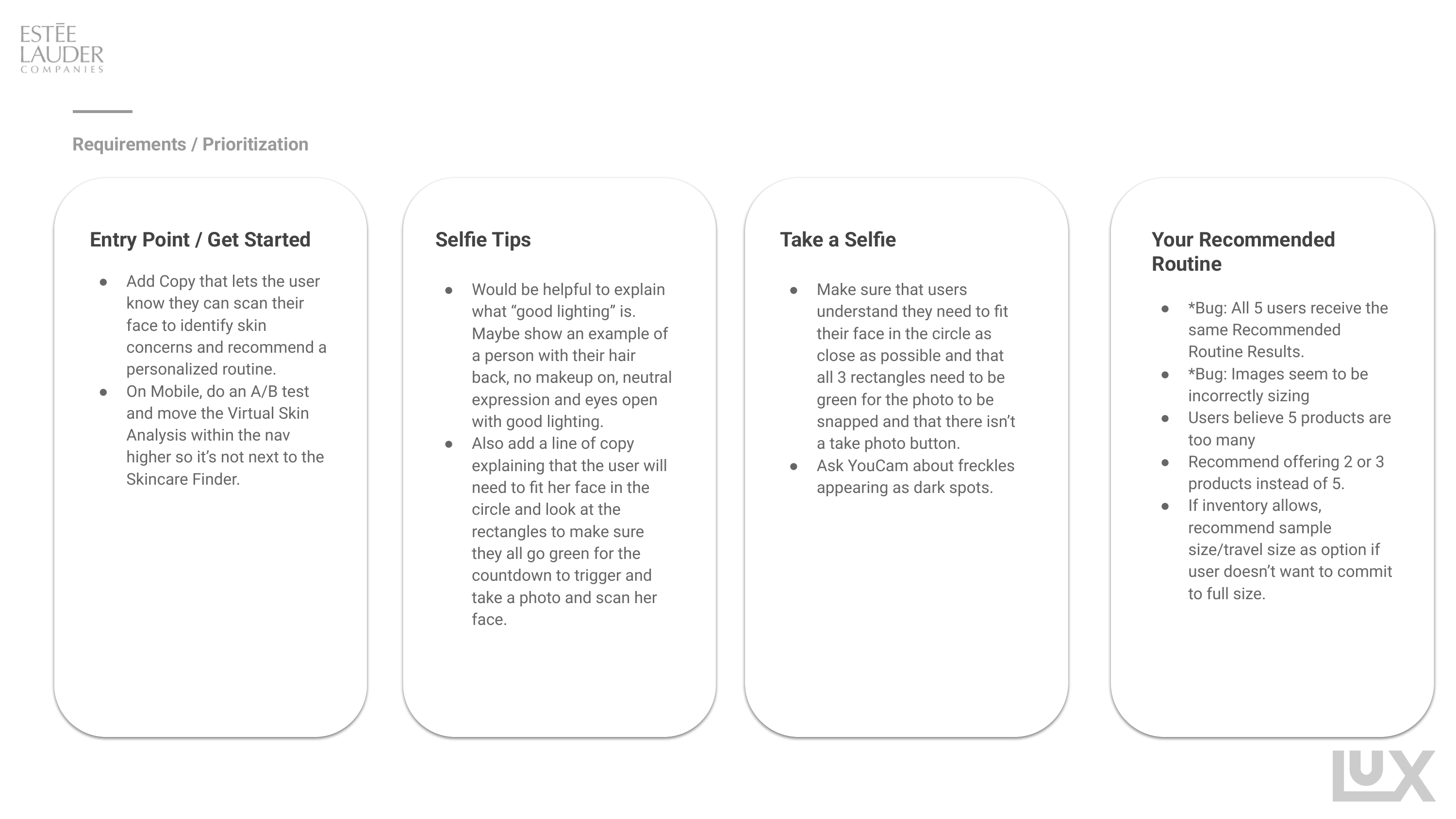
Findings sorted into a backlog,
not a list of complaints
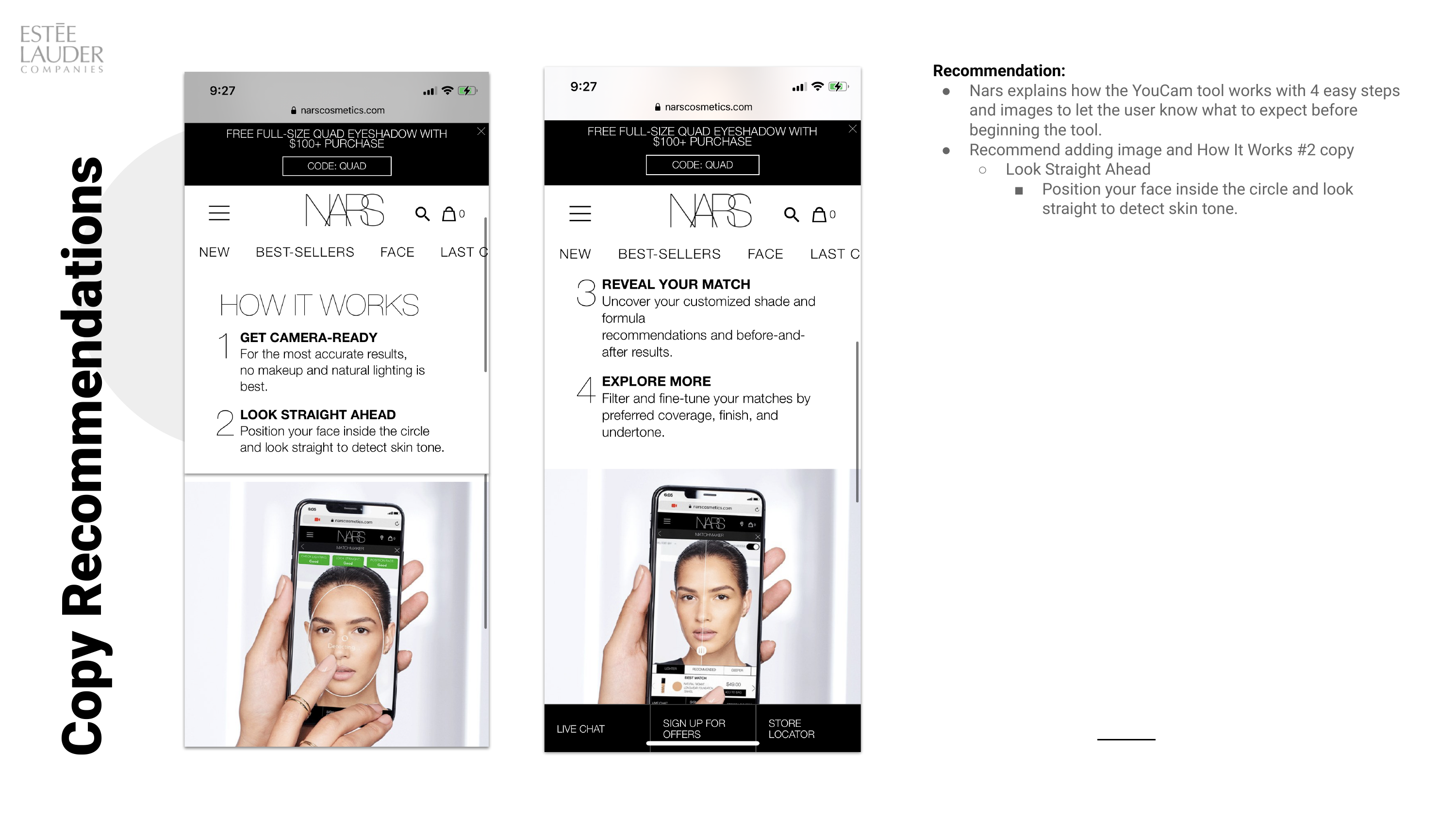
Every observation was attached to the screen it came from, graded for severity, and written as a change someone could pick up. Defects were flagged separately from design recommendations, because they have different owners and different urgency.
Three honest limits
The study sits in the post-launch column of its own roadmap. A defect returning identical results to every user is a pre-launch QA finding, and it took a usability study months after release to surface it. The lesson was not about the method, it was about when the method gets invited.
The design called for three iterative rounds. Round one found the surface problems and the deeper questions never got tested, so what is here is the first pass of a plan that was built to go further.
Participants raised whether lighting was driving their results, and freckles being read as dark spots suggests they were onto something. That is a computer vision validation question, not a usability one, and it needed a study of its own that I would scope now rather than hand back as a note.